Landing pages are the backbone of online advertising. A brilliant lead capture page encourages users to take action. Hence, landing pages serve as an excellent lead generation tool.
However, not all pages perform equally well. The average conversion rate for a landing page across all industries is around 2%, while a good conversion rate can reach as high as 11%.
One of the most vital elements of a landing page is the form. The type of form you use in your lead generation pages can literally make or break your ad campaigns.
Therefore, it is crucial to understand the different types of landing page forms and how you can use them to elevate your conversions.
You can certainly make your PPC campaigns perform more than the average by following the best practices of landing page form creation.
In this article, I will discuss what is a landing page form, share the different kinds of forms you can use in your lead capture pages, talk through some conversion boosters to improve the performance of lead pages, list some of the mistakes to avoid, and finally, discuss some of the best examples to take inspirations from.
Let’s begin.
What is a Landing Page Form?
A landing page form is a regular web form containing specific fields based on your ad campaign goals to capture vital visitor information and generate high-quality leads.
Landing page forms are a necessary step in your customers’ journey because they help take your target audience to the next level in the buyer funnel.
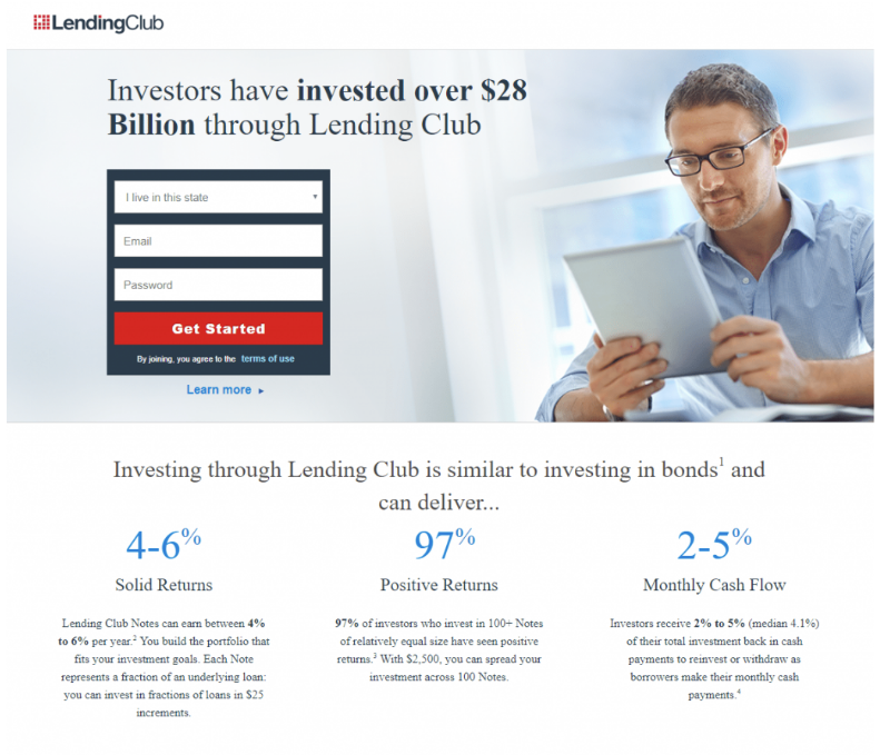
Here is an example of a simple landing page form from LendingClub that asks for user location, email, and password to get started.
Does The Form Length Matter?
Yes, form length impacts conversions. Therefore, you must carefully select the number of fields you wish to include in your landing page forms.
The safe bet is having five fields or less because they require less work from users and are less time-consuming.
However, there are certain exceptions to this, and a decrease in form length does not always impact the number of conversions positively.
A Marketing Experiments study claims that they witnessed an increase in conversions by around 3.4% when they reduced the form fields from 9 to 5. Every additional field in the form resulted in a conversion drop of about 8%.
Another study by Unbounce witnesses a 14% drop in conversions when they reduced the number of fields in the form from 9 to 6.
What do these studies tell you?
Sometimes, users want and expect more fields, while there may be instances when users don’t like too many fields.
For example, if someone is looking to estimate the value of their house, then more fields are expected. However, when someone is interested in a free software trial, they just want to get started with fewer fields.
Therefore, context is relevant for landing page forms. Longer forms require more user effort, and people are willing to show extra effort if the service offered is more extensive.
The longer the form, the more incentive users need to fill it. Hence, you can use a more extended form if your offer is significant and a shorter form if your offer is small.
In most cases, following the above rule works.
However, to make things perfect, always A/B test your form fields to see the impact on conversion rates.
How Many Types of Landing Page Forms Are There?
Here are the types of forms that you can use on your landing pages:
1. Embedded Form
Embedded forms are static short forms on a website that are used to capture relevant visitor information.
These forms fit the look of your web pages and are the classic way to generate more business leads.
Here is an example of an embedded form in action that asks for user name and email address:
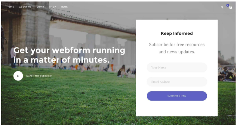
Asking for too much data might lead to form abandonment.
Therefore, embedded forms are used to keep the information to a minimum so that the users don’t feel bored filling them up.
2. Multi-Step Form
Multi-step forms are a real page-turner. They are used when you are using 5+ fields and need a sufficient amount of visitor information.
Multi-step forms perform better than single-step long forms.
One of the best practices is to display a progress bar so that the visitors know how far they have reached in providing the data and how much is still left.
Progress bars make the form-filling process less tedious.
Here is an example of a multi-step form in action with a progress bar:
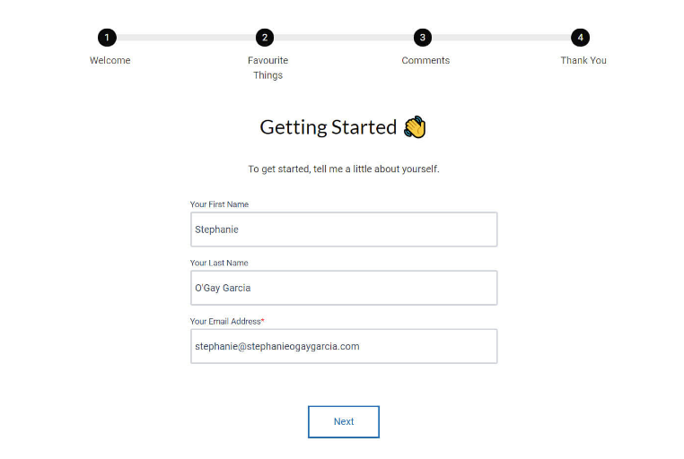
Multi-step forms are helpful for both B2B and B2C businesses. They can be used as product ordering forms, demo booking forms, or for collecting visitor information online.
3. Lightbox Form
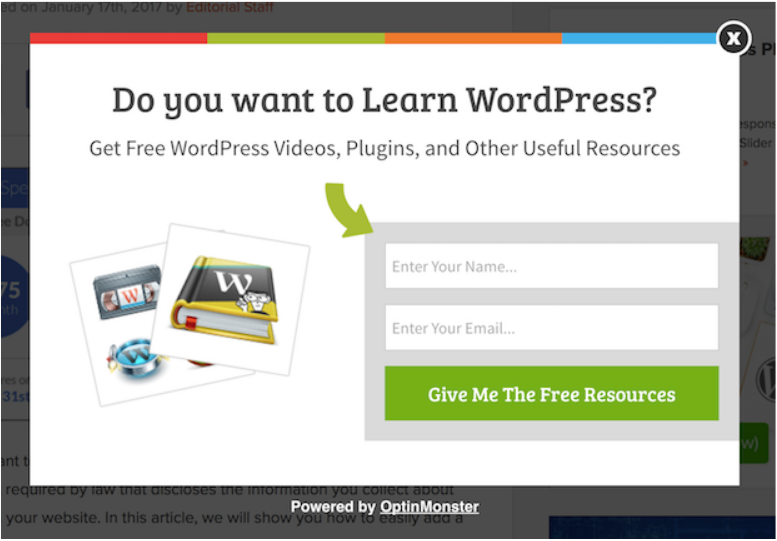
Lightbox forms are popup forms that open when a visitor clicks on a link or a button.
Lightbox forms have the highest conversion rates, and they work best for shorter forms having 2-4 fields.
Here is an example of a Lightbox form in action from OptinMonster:
Best Practices That Will Improve Your Forms Conversion Rate
Businesses are often confused, how can they create an exceptional landing page that persuades visitors to become customers.
There are certain vital elements that high-converting landing pages have. It is crucial to understand these essential landing page components to inspire your next landing page creation.
Here are some of the finest ways to improve landing page conversions:
1. Reduce Typing
Make it easier for the visitors to fill in their details by reducing the amount of typing they need to do.
Try using a combination of touch elements such as sliders, drop-downs, and image buttons to expedite the form filling process.
Also, enable browser auto-fill to avoid the need to fill the same login info again.
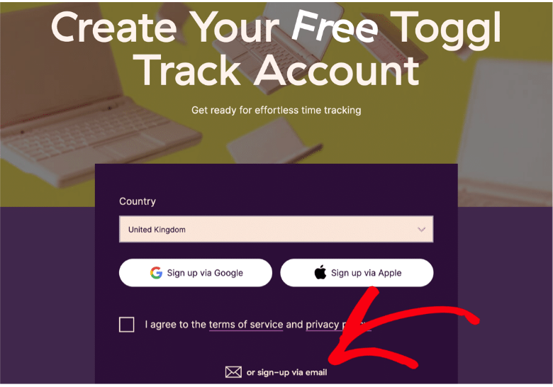
Here is an example of a Lightbox form that is minimalistic and avoids the need for typing. It uses a drop-down and Google sign-in for websites.
Bonus: Designers create image-heavy landing pages containing unnecessary JavaScripts and CSS that do not load perfectly on mobile devices. Keep this in mind and test all your landing pages on mobile before making them live for users.
2. Add Directional or Visual Cues
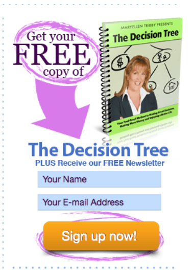
Directional cues help users see the essential elements of your landing page – the CTA (Call to Action).
When you make it easier for the visitors to see your CTA, they are more likely to take instant action.
The popular Directional or Visual clues can be any one of the following types:
- Arrows
- White Spaces
- Color Contrast
- Eye Gaze
Here is an example from Working Moms only which contains a brightly colored arrow pointing towards the email subscription form.
Similarly, here is an example of an eye gaze directional cue in action from FluidSurveys, which is pointing towards the form:
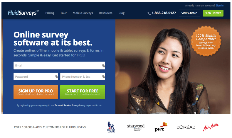
Visual cues signal the brain towards the significant elements in your web page. They help to strengthen visual hierarchy, enhance scannability, and increase conversion rates.
3. Include Relevant Forms
To optimize your landing pages for success, you should add different forms depending on your campaign goals.
The structure of your landing page form must match the overall design, and the kind of form you choose should match your campaign KPI.
For instance, if the goal is to acquire the email address of visitors, then the Lightbox form is an excellent option.
If the goal is to sell a product, then use a multi-step form with a progress bar to make it easy for the customers to fill in their information.
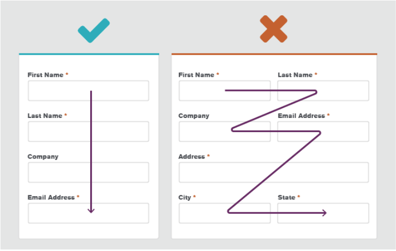
Also, remember to use a single-column approach to design forms. Here is an example of the pattern your forms should follow:
Another thing you shouldn’t forget when adding forms to your landing page is inline validation. It helps you detect any inaccuracies in the filled content and prompts the user about the incorrect data entered in the specific field.
Here is an example of inline form validation in action:
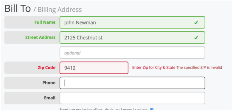
Hence, you should always select relevant forms depending on your campaign goals.
Besides, you should use a single-column style with inline validation to offer a better user experience and generate maximum conversions.
4. Keep The Form Above The Fold
Above the fold content is the content visible to the user as soon as the page loads.
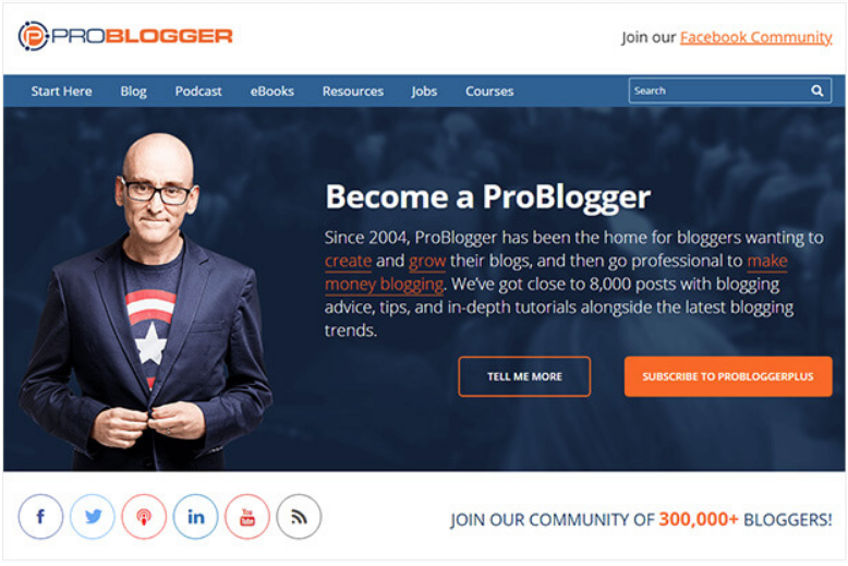
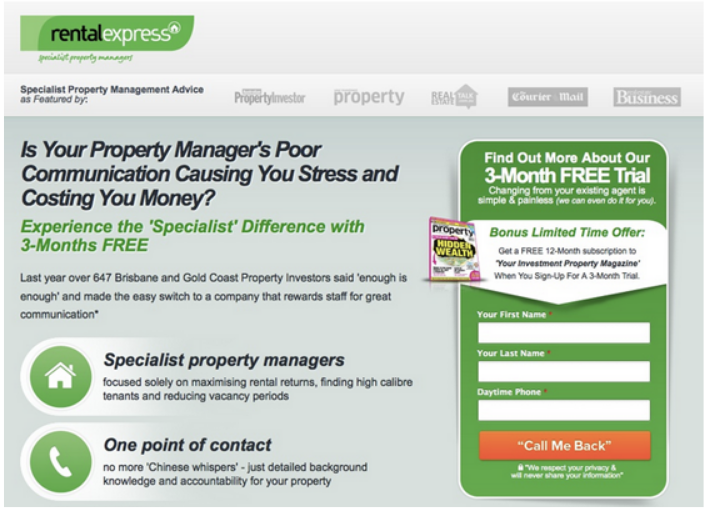
You should always keep the most critical elements of your page, like the form and the CTA, above the fold.
Here is an example of above the fold CTA from Problogger:
Here is another excellent example of above the fold landing page form and CTA from Rental Express:
5. Include a Privacy Statement
A privacy policy is essential for a website because it shares information about the organization and also provides company views about the information collected from the forms used in the website.
If you are collecting visitor data, then a privacy policy is required by law. The California Online Privacy Protection Act shares more details about it.
Besides, Google requires every website to have a privacy policy to run ad campaigns.
Therefore, a privacy policy is needed to increase user trust, and it also enables your ad campaigns to run successfully on Google.
6. Use First Person in CTA
The first person CTA is the CTA that is written from the point of view of the reader.
For instance, instead of using “book your table”, as the CTA text, you can use “book my table”, which will positively affect the number of conversions.
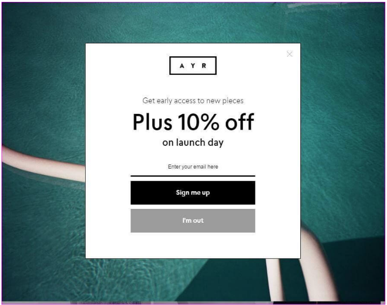
Or, if you are using a CTA to increase email subscribers, you can use a text like “Add me to the list” instead of using a traditional CTA such as “Subscribe to our newsletter”.
Here is an example of a Lightbox form using first person CTA:
7. Display Benefits Next To Your Form
To persuade people to fill in your forms, marketers leverage the tactic of displaying the product or service benefits next to it.
Here is an example of a landing page from Asana that lists the plan’s benefits next to the signup form.
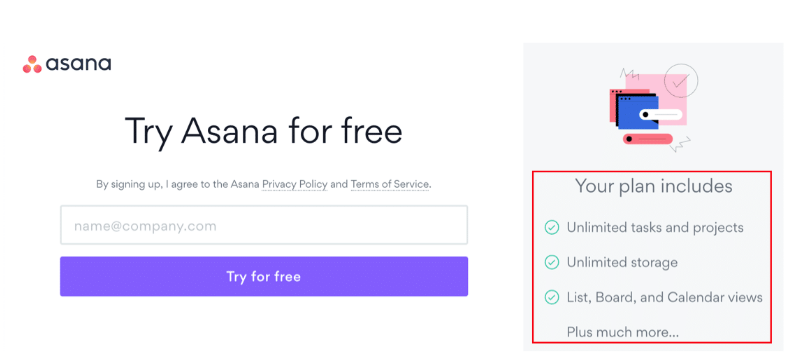
Listing product benefits is an excellent way to raise the level of excitement to start using the product.
8. Create The Perfect Call To Action (CTA)
The CTA is the most important element of your webpage.
The text that you write in your landing page buttons is called the CTA. A compelling CTA drives more user actions.
To create the best call to action, you should aim to use text that matches the user intent.
If you strike at the user’s pain point and offer a straightforward solution or place an offer before the visitors that are too good to ignore, you will have the maximum chance of acquiring more customers.
For example, instead of using a CTA like “sign up for a trial”, if you are selling SEO software, you can use a CTA such as “Start optimizing my website”. This CTA is proper because it personalizes the text for the user by using a first-person CTA.
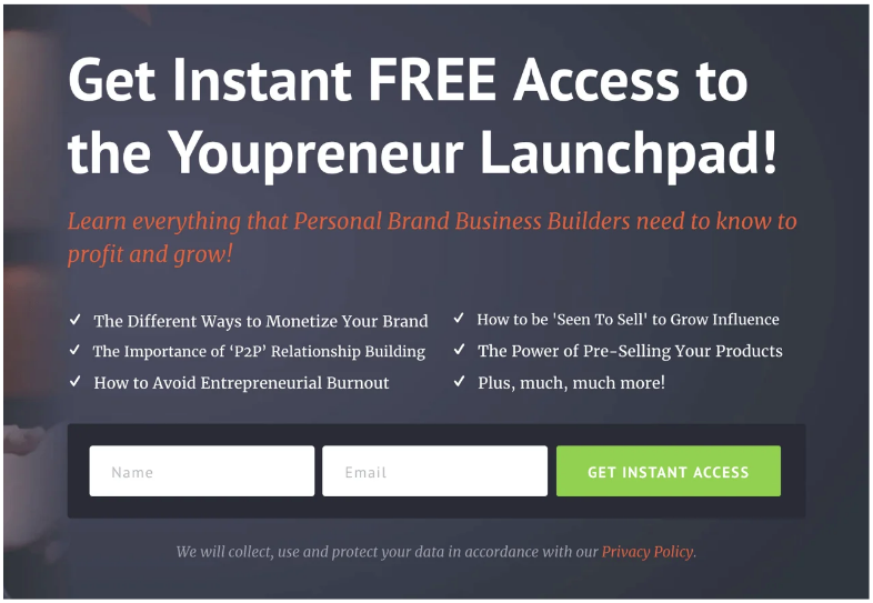
Moreover, action words perform the best because it tells the viewers what to do next. For instance, instead of using the word “Sign up”, you can write “Sign up today and get 40% off”.
Here is an excellent example from Youpreneur that uses an action-oriented CTA to increase email sign-ups:
9. Add Fomo To Your Landing Page Form
FOMO stands for ‘Fear of Missing Out’. People hate to miss offers. Therefore, if you wish to increase your sales faster, then start using the magic of FOMO.
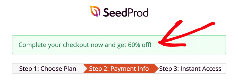
You can use FOMO cleverly in your landing page form to persuade users to take faster action.
For instance, here is a FOMO example in the landing page form. See how intelligently SeedProd has used the text “Complete your checkout now and get 60% off”. The offer is too good to ignore, and it persuades users to complete the checkout and claim the discount.
10. Leverage A/B Testing
A/B testing is an experiment to determine which version of your landing page yields better conversions.
Whenever you run ads, create two versions of your landing page and test each of them to determine a winner.
The winning version will help you increase conversions without increasing your ad budget.
For instance, here is a study published by Unbounce that displays two different versions of a landing page form.
The first form has a security seal, while the landing page form does not have it.
The form with the security seal acquired 12.6% more conversions compared to the one without the seal.
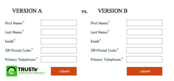
Hence, it is always better to test the landing pages in your campaign to see which version works best to achieve your campaign goals.
Mistakes To Avoid While Creating Landing Page Forms
You desperately want people to click on your form button. However, there are certain mistakes that you should not make while designing your landing page forms.
Here are the top landing page form design mistakes to avoid:
1. Using Phone, Age, and City/State Fields In Your Form
Interestingly, using the phone field results in a 5% drop, adding the age field results in a 3% drop, and using the city/state field lowers the conversion rate by 2%.
Therefore, stop using these three fields if you wish to achieve higher conversions on your landing page forms.
2. Not Using Popup Forms Carefully
Popups have always remained controversial because they ruin the user experience. People hate forms that pop out of nowhere and block their browsing experience.
However, popups do generate good conversions. Hence, you should use them carefully on your landing pages.
For instance, don’t use them everywhere on your site. You can use them in a specific campaign for a limited period and see the people’s reactions.
As an alternative, you can simply use a 2 to 3 field embedded form that collects user data.
3. Not Providing Quick-Fill Tools
Make it easier for the visitors to fill in your form. Less typing = more success.
Use dropdowns, add text in fields that helps users know what to fill in them, and enable browser auto-fill for automatic form filling.
4. Not Matching Form Design To Customer Journey
Your form design should match the customer journey. Therefore, you should create a customer journey map to understand the placement of your target audience in the buyer journey funnel in accordance with your current ad campaign needs.
There are three buyer journey stages:
- Top of the Funnel (TOFU)
- Middle of the Funnel (MOFU)
- Bottom of the Funnel (BOFU)
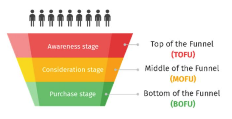
For instance, if your target audience is at the top of the funnel, then you should use personalized CTA in the form to pull them down the funnel.
In the TOFU stage, your form should have a minimum field like an email address.
If you are targeting audiences at the MOFU stage, then the audiences should already know your brand. At this stage, you should use a focused CTA.
Here is an example of a MOFU CTA in action:
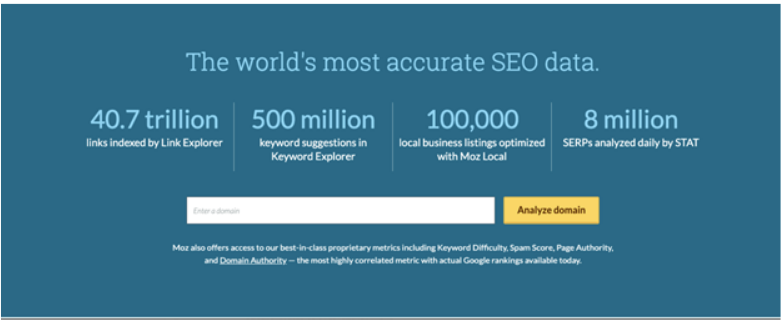
People reaching the landing page should already know what Moz does, and their goal should be to analyze their domains.
In the BOFU stage, you should guide the users towards the purchase. People already know your brand, and they just want to buy your products or services. Your target keyword selection, ad copies, landing page copy, and landing form text CTA should match the user intent.
Therefore, analyzing the customer journey while designing landing page forms and CTA is vital for your campaign success.
5. Not Using Form Analytics Tool
Form Analytics is a vital tool that measures critical metrics such as form abandonment rate, interaction time, user behavior, ignored fields, and time report.
Tracking and optimizing for such metrics helps to improve UX and conversions leading to more business profits.
Some of the top form tracking tools are:
- Google Analytics
- Monster Insights
- Mouseflow
- Clicktale
- Hotjar
- SessionCam
- LuckyOrange
- Leadformly
By leveraging the power of form analytics software, you can remove the friction between users and conversions.
6. Not Testing Your Form
Before making your form live, you should thoroughly check the functionality and fix any issues that could hamper the user experience.
Here are some of the elements that you should test:
- If the user enters an incorrect value, then your form should prompt the user to fix it.
- Both you and the user should receive notifications once the form is submitted.
- If the form is related to payment, you should check whether your payment processor is working correctly.
- Your form should be responsive and work on all devices, including mobile and desktop.
- Your form should load quickly, and there shouldn’t be any core web vitals issues on your landing page that might affect the functionality of your form.
- Users should be redirected to the thank you page after they submit the form. You should check whether a successful form submission is being tracked accurately in Google Analytics.
Best Examples of Landing Page Forms
You must have seen a lot of examples of great landing page forms throughout this article. Now, I will share some more brilliant examples of landing page forms that are worth bookmarking.
Here are some of the top examples of outstanding landing page forms:
1. Dear Chefsteps
Dear Chefsteps is a recipe website for home cooks. When you land on their homepage, you will find a short and simple sign up form that targets the pain point of the users.
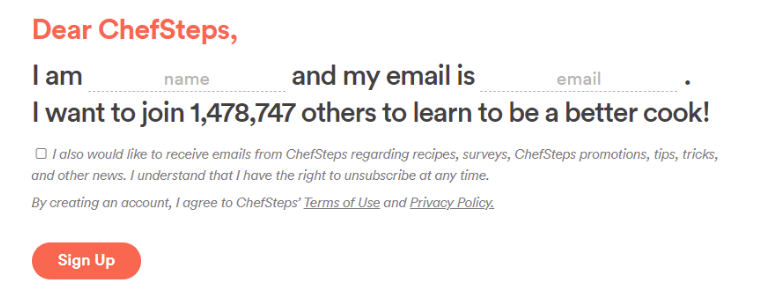
People visiting the website want to become better home cooks, and hence, the text leverages powerful copywriting to grab user details as soon as they land on the website.
Now, another essential thing to note here is the placement of the form. The signup form has been placed intelligently above the fold as the first element after navigation for maximum visibility.
2. Oscar Health Insurance
Oscar is a health insurance company. They have created an exceptional signup form to make it easier for users to register for their health insurance services.
The form is conversational, and it feels like you are talking to a person instead of filling a form.
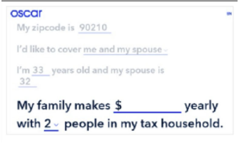
Therefore, the chances of users completing the form increase leading to more business leads.
You can replicate this idea in your landing pages for forms that require sufficient user input.
3. Lemonade Insurance
Another insurance company perfects the idea of user-friendly landing page forms.
Lemonade is an insurance organization based in New York City, USA. To double the power of their landing page forms, they use automation.
The Maya insurance chatbot allows customers to purchase insurance, file claims, and resolve customer service inquiries.
The concept is the same, creating conversational forms to make it easier for the users to provide relevant information.
The form has a picture of a smiling lady (Maya) to welcome new users.
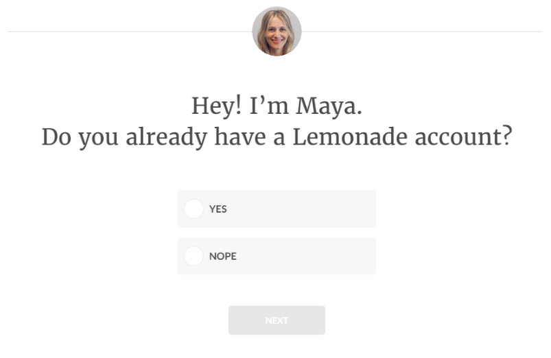
After you fill in your info, the bot greets you with your name and starts a conversation like “Great to meet you Jack! What’s your home address?”
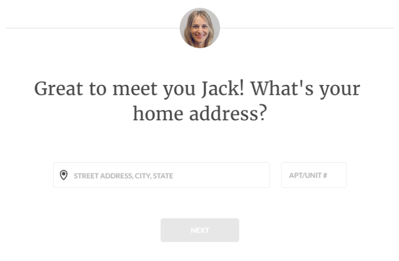
The bot then assists the users in filing all the missing details in the form.
Such an exceptional, conversation-friendly interaction is impressive for customers, and they might also recommend others to join the business.
4. Quickbase
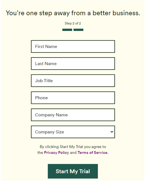
Quickbase is an application development platform. They have a simple sign up form, which is just two steps long.
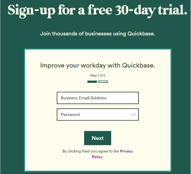
Often, you don’t see businesses using progress bars when the signup form has only two steps.
But, Quickbase is quick to adapt itself to consumer psychology, and it uses a short progress bar to inform users that the form has only two steps.
In the password section, users have the option to auto-fill a chosen password. Hence, instead of thinking and typing passwords, users can instantly click on the provided password and proceed to the next step.
After the first step is filled, users are provided with a message that says, “you’re one step away from a better business”. Even though the form has six fields, Quickbase has made it uncomplicated for the users to fill the form.
5. Active Campaign
Active Campaign is a customer experience automation platform that requests just one user input to get started.
When you land on the homepage, you can see a form requesting an email address to start the free trial.
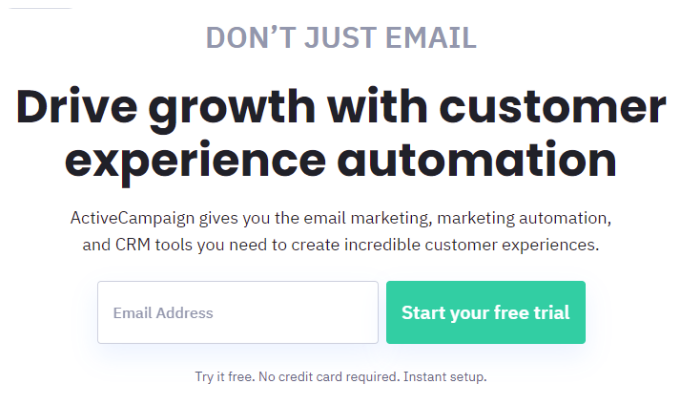
To dissolve the user’s fear and provide confidence to proceed further, the below text is shown right below the signup section.
Try it free. No credit card required. Instant setup.
When you fill in the email, the process is automated, and again a conversational approach is added to simplify the user onboarding journey.
Active Campaign requests the name of the user and then their phone number. This is a great way to collect user information.
6. Crazy Egg
Crazy Egg is a website optimization platform. It offers one of the finest examples of landing page forms using perfect, persuasive, and personalized copywriting techniques.
When you land on the website’s homepage, you see a signup form above the fold. Notice the placement of the top navigation. The navigation is shifted to the right side to enhance the visibility of the form.
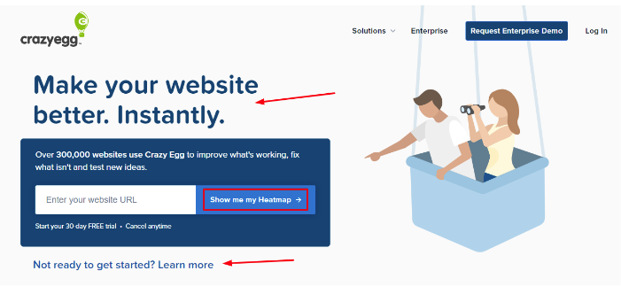
The headline says, “Make your website better instantly”. Waiting time is one of the most significant customer pain points, and Crazy Egg does an excellent job of removing it from the customers’ minds by using the word “instantly”. People will feel like I will get the results instantly, so let me try it.
Therefore, I always say copywriting plays a crucial role in your landing page forms.
Also, notice the personalized CTA text which says, “show me my heatmap”. Using a first person CTA text, Crazy Egg personalizes the customer onboarding experience leading to more conversions.
Which Form Should You Choose For Your Landing Page?
Now that you have seen so many examples of landing page forms, it becomes overwhelming which ones to choose and when? I will make it easier for you.
If you are targeting the branding phase of the customer journey, use short forms one to two fields long. Else, if you are creating landing pages for user signups and payment, then use a conversational style form.
Moreover, it would be best if your business uses an automated chatbot as a signup form. As seen from the examples above, more and more brands have already started using marketing automation to smoothen the customer onboarding journey.
Whichever form you choose for your business, make sure to A/B test it to get real-time user interaction results to further optimize the forms for better conversions.
Landing Page Form Best Practices
Having a clear, intelligently designed, and persuasive form is significant for effective landing pages. This landing page form creation guide has covered every tip and trick you need to create perfect landing page forms. Follow these form design best practices to secure higher conversion rates and elevate your business profits.

