
42 Facebook Ad Examples to Help You Ditch Dull Ads Forever

A swipe file is only useful when you know what you are looking at.
You can save hundreds of Facebook ads and still learn very little if every note says the same thing: strong visual, clear copy, good CTA. The useful questions are more specific. Who is the ad for? Which objection is it answering? What does the format allow the brand to communicate? Why might this message matter to that audience?
The 42 examples below were originally collected from Facebook advertising in 2020. They should be read as historical creative examples, not as a list of ads currently running or proof of present-day performance. What remains useful in 2026 is the thinking behind them: positioning a product against a misconception, making an abstract benefit visible, reducing commitment anxiety, or giving a familiar audience a new reason to pay attention.
Key Takeaways
- Start with the audience tension, not the product feature.
- Use the visual and copy to do different jobs instead of repeating each other.
- A format works when it helps explain the idea. Carousels suit sequences and comparisons; video suits movement and demonstration.
- Specific proof is more persuasive than a broad claim, provided the proof is accurate and supportable.
- Familiarity can be useful, but so can surprise. The right choice depends on what the audience already believes.
- Treat every example as a hypothesis to test, not a template guaranteed to perform.
How to Use Facebook Ad Examples Without Copying Them
The Meta Ad Library lets you inspect ads associated with an advertiser across Meta products. It is useful for seeing current creative, copy, formats, and variations. It does not tell you whether an ordinary commercial ad is profitable, and a long runtime is not proof that the advertiser has found a winner.
When you find an ad worth saving, write down four things:
- The audience it appears to address
- The belief, desire, or objection behind the message
- The job performed by the creative format
- The single principle you could test without copying the execution
Meta’s own creative inspiration resources can help with formats and platform-native conventions. For the testing process itself, keep the variables controlled. If you change the image, headline, offer, and audience together, you will not know which change produced the result.
SaaS and B2B Facebook Ad Examples
1. Keap
Keap used Neil Patel’s endorsement to solve a trust problem that is common in software advertising. A CRM can be difficult to evaluate from a short ad because the value depends on how it fits into a larger marketing and sales process. An endorsement from someone already associated with digital marketing gives the audience a familiar shortcut.
The endorsement also supports Keap’s larger promise: fewer disconnected tools and less time spent forcing a marketing stack to work together. That is more compelling than presenting another list of CRM features.
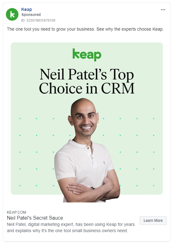
What to test: Compare a recognized expert’s specific use case with a brand-written benefit. The expert should be relevant to the buyer and the endorsement must be genuine.
2. SEMrush: Let the Offer Carry the Ad
SEMrush paired an emotional idea with free access to a paid product. The combination matters. Emotion earns attention, but the trial gives the audience an immediate, low-friction next step.
For a software product that users understand best by exploring it, access can be more persuasive than a feature explanation. The offer allows the buyer to experience the value rather than accept the brand’s description of it.

What to test: A free trial against a discounted first month. Measure what happens after signup, not only how many people begin.
3. Black Propeller: Make the Agency Visible
Black Propeller’s ad used an employee, the office, and a phone camera instead of polished stock creative. That choice answered a question prospective clients often have but rarely state directly: who are the people behind the agency?
The setting provides evidence that the company exists beyond a logo and a pitch deck. It also makes the creative easy to reproduce with other employees, messages, or areas of the office.
Its value cannot be reduced to “authentic content always wins.” The lesson is narrower: when the relationship is part of the product, showing the people and environment can reduce distance between the buyer and the business.
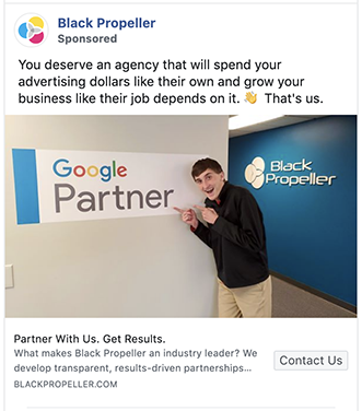
What to test: A real employee explaining one concrete client problem against a conventional branded agency ad.
4. Moz: Build Depth Into a Flat Software Story
Software ads often struggle to show both the product and the person using it. Moz solved that visually by combining people with interface or report imagery.
The composition gives the viewer two pieces of information at once: this is a tool with a tangible output, and this is a tool used by people like you. The heavier copy treatment also distinguishes it from SaaS ads that rely on minimal text and abstract product screens.
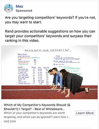
What to test: A human-plus-interface composition against a clean product screenshot. Keep the message and audience constant.
5. Golfshot: Use a Carousel to Explain a Product
Golfshot has several features, which makes a single static ad a poor container for the whole story. Its use of Meta’s carousel ad format gives each feature its own card and lets the interface demonstrate what the app does.
The format turns a potentially overwhelming feature list into a sequence the viewer controls. It also allows the brand to show the product rather than describe it abstractly.
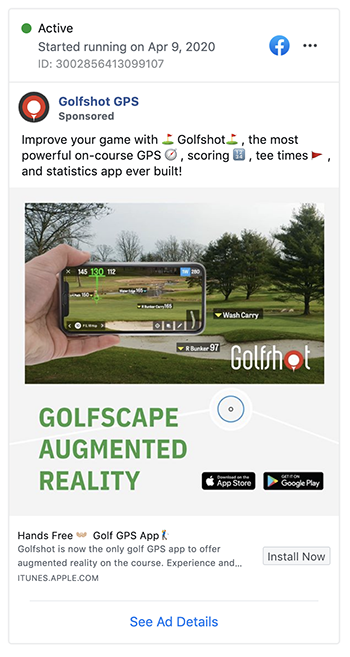
What to test: One feature per carousel card against a single image featuring the strongest benefit. Look at downstream conversion quality as well as card engagement.
6. Tailwind: An Influencer Who Demonstrates
Tailwind’s influencer creative went beyond endorsement. The creator explained how the product fit into her own workflow.
That distinction is important in B2B and creator software. “I like this tool” offers social proof; “this is how I use it to achieve a result” gives the audience a model it can imagine following.
The creator’s visual style also matched the lifestyle language of Pinterest and Instagram, the platforms Tailwind was built to support.
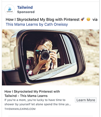
What to test: A creator tutorial against a short testimonial from the same person.
7. Shopify: Speak to the Person Behind the Store
Shopify’s ad appealed to the pride and ambition of small business owners instead of leading with ecommerce infrastructure.
The second-person language makes the viewer the subject of the ad. Shopify becomes the enabler rather than the hero. That is a useful distinction for products whose customers are trying to build something of their own.
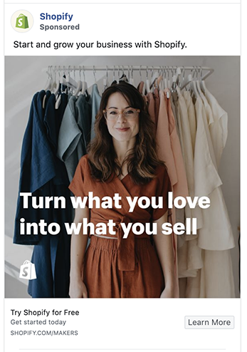
What to test: An identity-led message about the customer’s ambition against a product-led list of capabilities.
8. Asana: Make the Fear Concrete
Asana’s clean visual language reflects the emotional state project-management software is meant to create: control, clarity, and less chaos.
The ad also gives that promise an antagonist. Losing work, missing information, and wasting time are recognizable fears for collaborative teams. Showing people inside an interface helps connect the software to actual coordination rather than presenting it as abstract boxes and arrows.
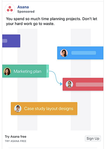
What to test: A consequence-led message about what teams risk losing against a positive productivity claim.
9. Monday.com: Name the Pain Your Audience Knows
“Never miss a deadline” works because it is not a generic promise of productivity. It names an outcome project managers are accountable for.
The ad’s contrast with familiar project-management tools adds another layer. By challenging an approach the audience may already find cumbersome, Monday.com presents itself as relief from an established frustration, not simply another software option.
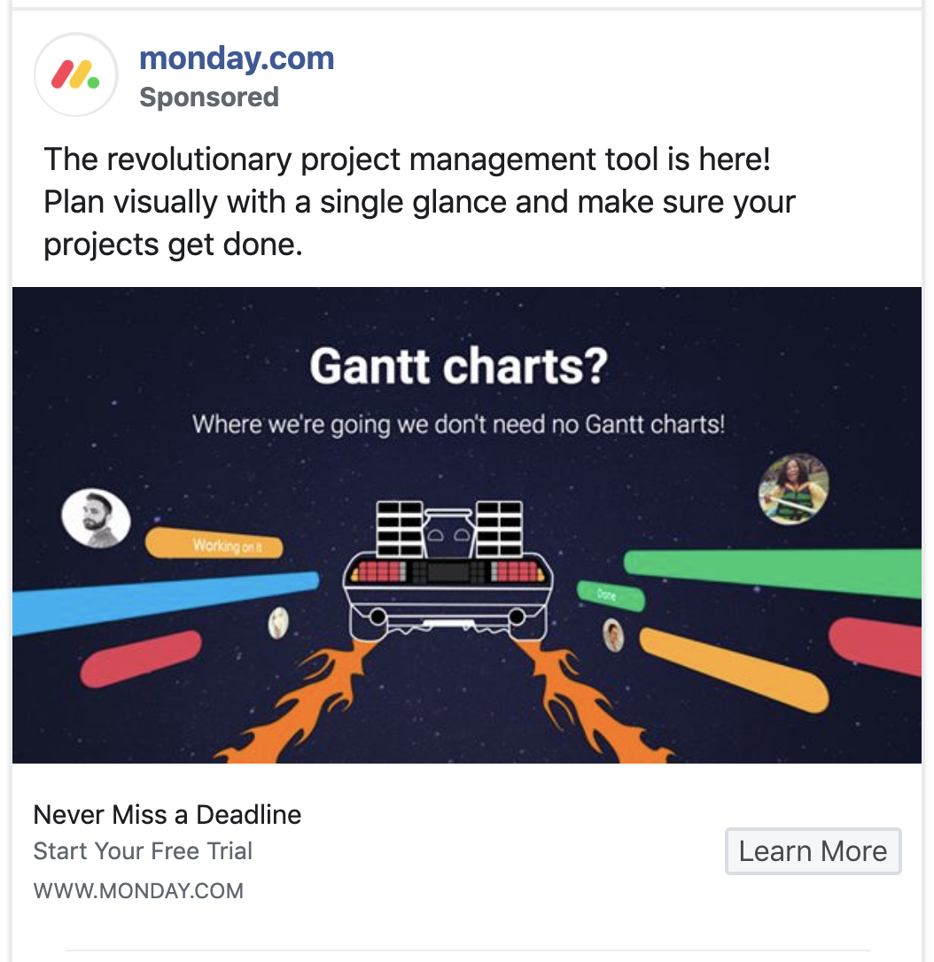
What to test: A message built around a feared outcome against a message built around a popular feature.
10. Gusto: Show the Moment of Relief
Payroll is valuable when it is finished correctly and on time. Gusto made that completion visible through a success screen.
This is stronger than a generic “save time” message because the viewer can recognize the exact moment the task stops occupying mental space. A precise time claim can make the promise more vivid, but it should only be used when the company can substantiate it and the conditions are clear.
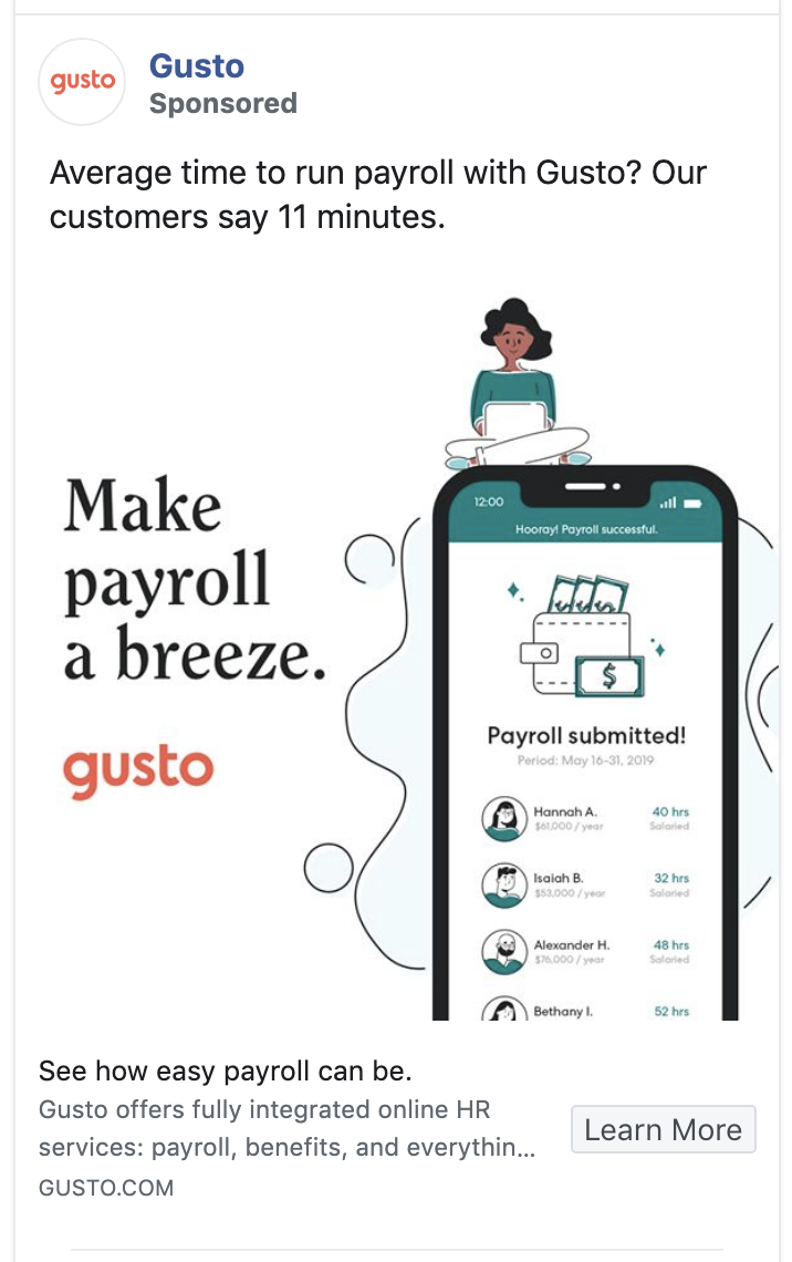
What to test: A completion-state visual against a setup or dashboard screenshot.
11. BigCommerce: Compete on a Known Limitation
BigCommerce acknowledged that buyers were comparing it with a major rival. Instead of behaving as though no alternative existed, the ad focused attention on a specific competitive limitation.
That approach can work when the comparison is important to the buyer and the claim is accurate. It gives the audience a reason to investigate rather than asking it to accept a vague statement of superiority.
The risk is equally clear: comparative advertising becomes weak when it exaggerates, attacks a straw man, or introduces a concern the audience did not have.
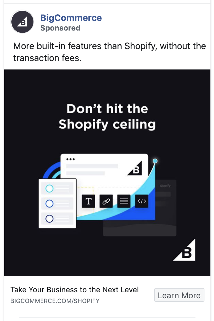
What to test: A supportable comparison on one purchasing criterion against a standalone value proposition.
12. Slack: Turn the Creative Into an Interface
Slack used a designed element that resembled something the viewer could click. This made the ad feel interactive and directed attention toward the next action.
The technique fits the product because Slack is itself an interface. Its colors and visual components reinforce product recognition while the ad teaches users about a capability they may have overlooked.
Interface-like creative must remain honest. A visual that invites interaction is useful; a fake control designed to trick someone into clicking is not.
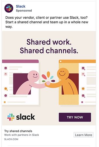
What to test: Product-native UI treatment against a conventional product screenshot.
13. Taboola: Let Each Comparison Breathe
Taboola used a carousel to compare its offering with an alternative. The format prevented several proof points from collapsing into a single crowded graphic.
Each card could focus on one distinction, allowing the audience to process the comparison in stages. This is exactly where carousel structure earns its place: not because carousels are inherently persuasive, but because a multi-part argument needs space.
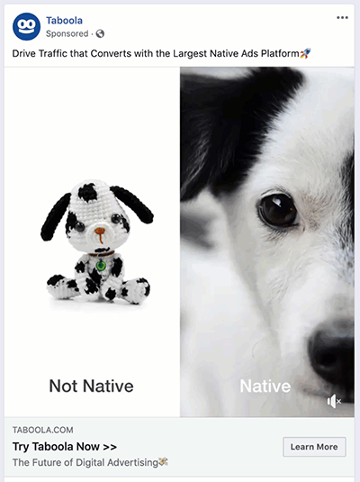
What to test: A comparison carousel against a concise landing-page teaser that invites the user to see the full comparison.
14. Harvard Business Review: Advertise to Existing Customers
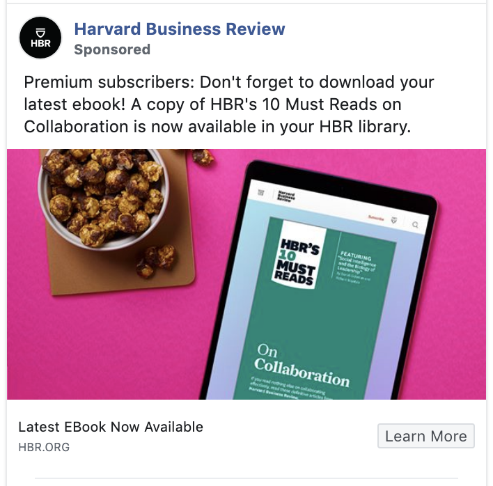
Harvard Business Review’s example reminds subscribers about value they already have.
That is retention advertising, not acquisition. The objective is to increase product usage and reinforce the reason to stay subscribed. When a customer discovers a feature or benefit they had ignored, the subscription can feel more valuable without the company changing the product.
This approach is especially relevant to software, memberships, and media products with several underused benefits.
What to test: An ad that introduces one overlooked subscriber benefit against a general brand reminder.
15. WebinarJam: Compress the Story
WebinarJam used a short line and an image that carried much of the explanation. The two elements worked together rather than restating each other.
Short copy is not automatically better. It works here because the audience can infer the product’s purpose quickly and the visual provides the missing context. A complex or unfamiliar offer may need more explanation.

What to test: A six-word outcome statement against a more explicit product description.
Ecommerce and DTC Facebook Ad Examples
16. DribbleUp: Correct the Misconception First
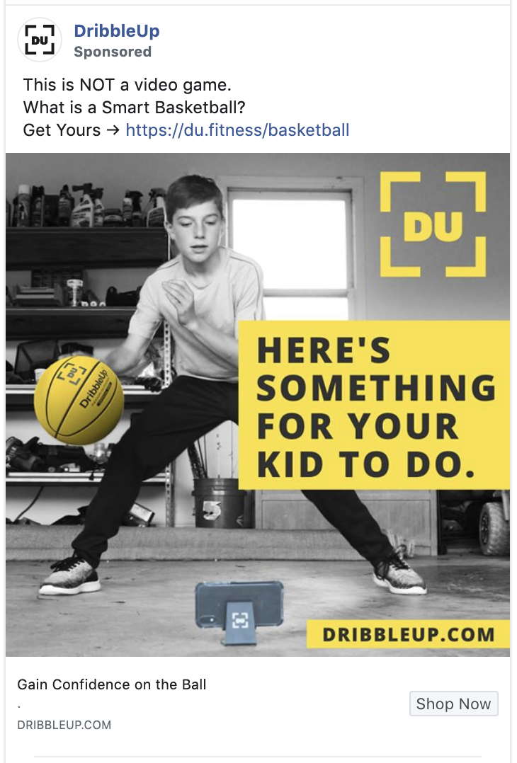
DribbleUp knew parents might dismiss the product as a video game. The ad confronted that belief before explaining the benefit.
“This is not a video game” changes the frame from entertainment to training. That makes the product easier to evaluate against the outcome the buyer cares about. The black-and-yellow contrast supports the hierarchy by pulling attention toward the product, brand, and action.
What to test: A misconception-breaking opening against a direct benefit statement.
17. Noom: Position Against the Category
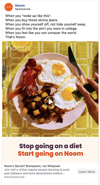
Noom did not present itself as another diet plan. It emphasized behavior and the psychology of eating.
That positioning speaks to people who may have tried conventional diets and rejected the cycle around them. The repeated copy reflects the audience’s desired future and gives the message a deliberate rhythm.
The lesson is not to oppose a category for attention alone. A contrarian position works when the product genuinely delivers a different approach.
What to test: Category-opposition language against familiar category terminology.
18. Happy Socks: Use Strangeness as a Filter
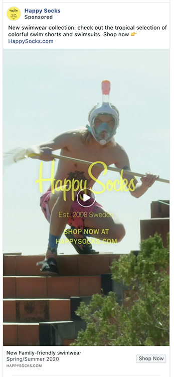
The Happy Socks creative creates a moment of visual confusion. The viewer has to pause long enough to understand what is happening.
That pause is valuable, but the stranger choice also acts as an audience filter. People attracted to the brand’s playful sensibility feel recognized; people who dislike it move on. For a distinctive brand, that can be preferable to creative nobody objects to and nobody remembers.
What to test: A deliberately odd, brand-consistent setup against a standard product arrangement.
19. Green Bean Delivery: Make the Product Selection Recognizable
The Green Bean Delivery image included products viewers may already know. Recognition helps the audience understand the service without reading a detailed explanation.
The testimonial adds a customer’s voice, while the less-polished photography makes the scene feel closer to an actual delivery. Neither element guarantees trust. Their value comes from specificity: recognizable goods, a believable environment, and a customer statement connected to the offer.
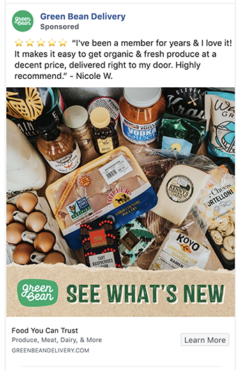
What to test: A customer-style delivery image against a controlled studio image using the same products and copy.
20. Muscle Milk: Do Not Dilute the Audience
Muscle Milk addressed people who strength train without softening the message for a general wellness audience.
That focus allows the brand to use language about discipline, effort, and strength that would feel excessive in a broad health ad. The product benefit and emotional identity reinforce one another.
Narrow messaging is useful when the targeted segment is commercially meaningful. It is not an excuse to exclude potential buyers without a reason.
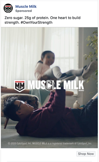
What to test: Core-audience language against a broader fitness message.
21. Trolls: Sell Immediate Access
The Trolls creative uses saturated color and sparkle in a way that belongs to the film. The visual is not decoration added to earn attention; it previews the world the audience is being invited into.
The offer also benefits from immediacy. The viewer can move from seeing the ad to accessing the film without planning a theater visit. The shortened distance between interest and consumption is part of the proposition.
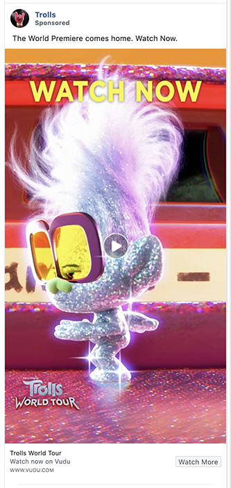
What to test: Immediate-access language against a story-led trailer message.
22. Mixtiles: Show the Product in a Real Setting
Mixtiles demonstrates the product in use, which answers practical questions about scale, arrangement, and the finished effect.
A local visual detail makes the scene feel more personal to the viewer, while the review count supplies evidence that other customers have used the product successfully. Ratings are useful only when current, accurate, and presented without manipulating what they represent.
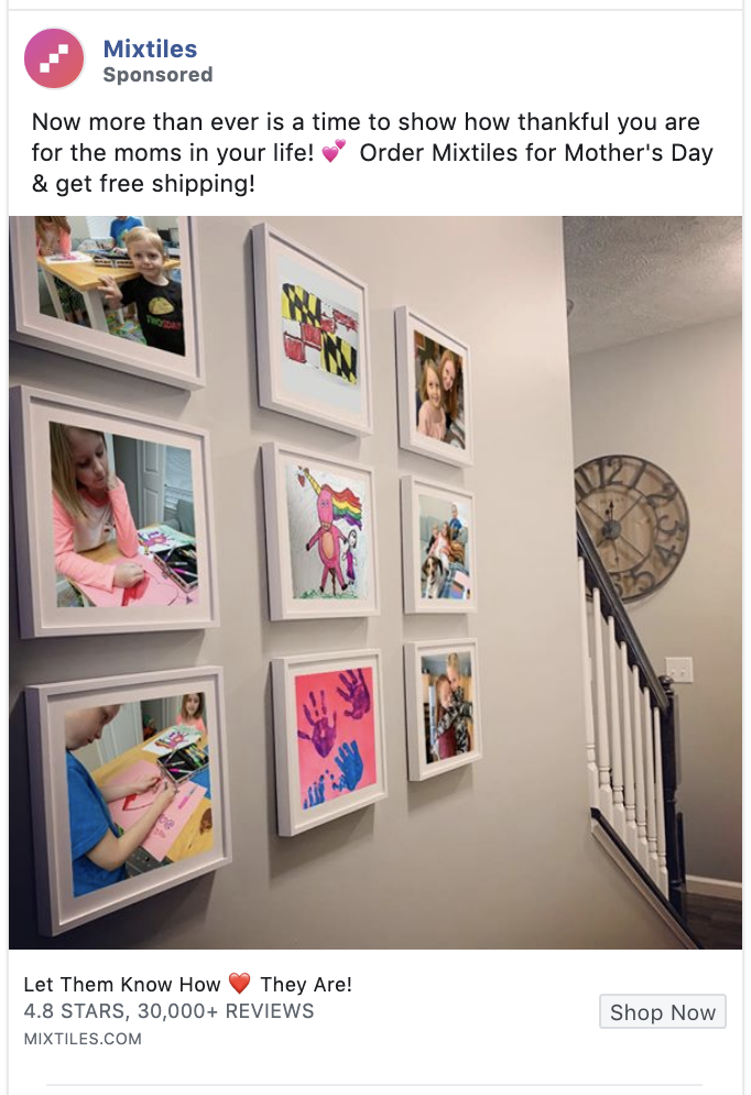
What to test: A locally adapted room scene against one national creative.
23. Arizona Iced Tea: Turn Packaging Into Participation
Arizona Iced Tea treated its packaging as material for a creative activity. The product became the starting point for something the audience could make.
That changes the role of the ad. Instead of asking for a purchase directly, it invites participation and gives existing customers a reason to handle, photograph, and share the product.
The original context was tied to people spending more time at home in 2020. The transferable lesson is broader: participation works when the task is simple, visually rewarding, and natural to the product.
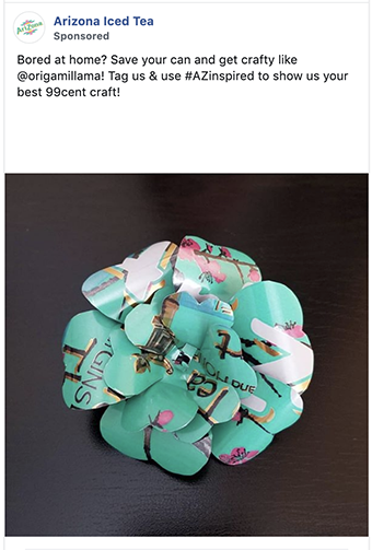
What to test: A customer creation prompt against a conventional product post.
24. Eggo: Use the Product as the Visual Idea
Eggo turned the product into recognizable art connected to a larger cultural reference.
This gives the audience two reasons to look: the craft of the execution and the pleasure of recognizing the reference. The visible hashtag helps connect individual posts or ads to a larger campaign, provided the audience can read and remember it quickly.
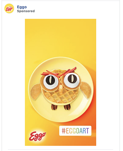
What to test: Product-made artwork against a traditional food photograph.
25. Headspace: Pair a Distinctive Brand With Specific Proof
Headspace’s simple shapes and saturated colors are recognizable even at small mobile sizes. That consistency helps the audience identify the brand before processing every word.
The ad also uses a quantified emotional claim. Specificity can make a benefit feel more credible, but only if the methodology and wording support what the ad implies. Emotional-health claims deserve particular care.
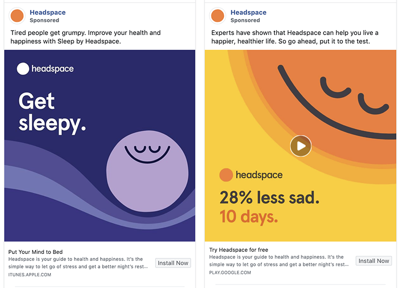
What to test: A supportable quantified benefit against a non-numeric statement of the same outcome.
26. Chewy: Use a Carousel to Teach
Chewy’s carousel shows that the format is not limited to a row of products. It can deliver a tutorial one step at a time.
Educational content gives the audience value before the purchase and lets the brand demonstrate expertise around the life of the customer, not only the item it sells. The original execution also used timely at-home and holiday context, which should now be read as a period-specific choice.
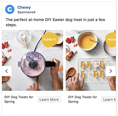
What to test: A step-by-step carousel against a direct product promotion.
27. Stitch Fix: Remove the Objection in the Ad
Stitch Fix condensed its service promise into a short line, then addressed a major source of hesitation: the assumption that using the service required an ongoing subscription.
The objection matters because it comes from the brand’s own category history. By resolving it before the click, the ad allows more people to consider the offer on the correct terms.
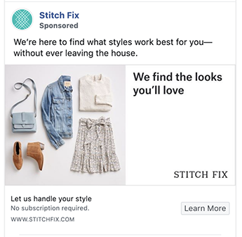
What to test: Commitment-removal copy against the core styling benefit alone.
28. Traeger Grills: Put the Product in the “Wrong” Season
Traeger placed grilling in winter, challenging the assumption that the product belongs only to warm-weather use.
The snow creates visual contrast and expands the usage occasion at the same time. This is stronger than adding a line that says “use it year-round” because the image proves the point immediately.
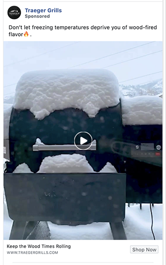
What to test: Counter-seasonal product use against predictable seasonal creative.
29. BarkBox: Entertainment Before Explanation
BarkBox used the anticipation of pet misbehavior to create a small story. The viewer wants to see what happens next.
That suits a product sold partly through affection and amusement. The ad makes the emotional experience of owning a dog visible before discussing the box itself.
Humor should still serve the audience and brand. A funny ad that people remember without remembering the product has not completed the job.
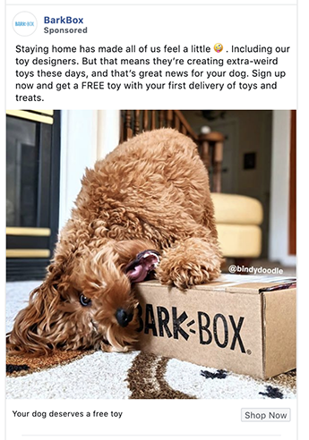
What to test: A relatable pet moment against a polished unboxing.
30. Oakley: Let Detail Justify Desire
Oakley’s close product shot allows the audience to inspect the object in the way someone might examine it in a store.
For a premium product, visible materials and construction can support the feeling that the purchase is worth indulging in. The creative does not need to apologize for desire; it gives the viewer a reason to see the product as a reward.
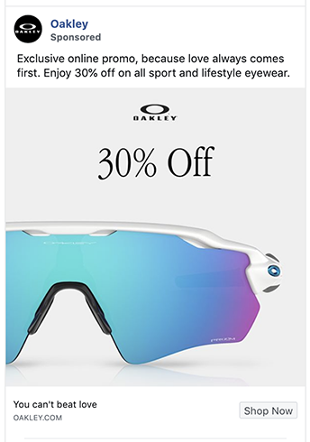
What to test: A macro detail shot against an outdoor lifestyle image.
31. Big Agnes: Invite the Audience Into the Brand
Big Agnes combined product use, humor, participation, and a broader cultural idea. The ad feels less like a product display and more like an invitation to join the brand’s way of seeing outdoor life.
That density works because the elements point in the same direction. Stacking tactics becomes confusing when each one asks the viewer to interpret a different message.
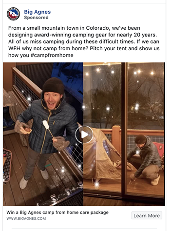
What to test: A customer participation prompt against a straightforward educational ad.
32. Rit Dye: Let the Transformation Prove the Point
Rit Dye used a before-and-after structure to make the value visible without requiring a long explanation.
The transformation also connects the product to reuse. The audience is not only changing a color; it is reconsidering an item that might otherwise be discarded. That gives the product both a creative and a practical role.
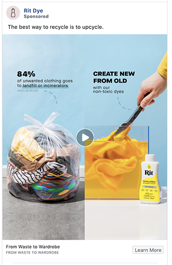
What to test: Side-by-side transformation against the finished item alone.
33. Duluth Trading: Direct Attention Deliberately
Duluth’s composition uses the subject and product orientation to lead the eye toward the message.
That is a basic but useful design principle: people follow directional cues. The offer, including free shipping, then gives the audience a concrete reason to act. Shipping language should be tested against margin and order value rather than assumed to be universally beneficial.
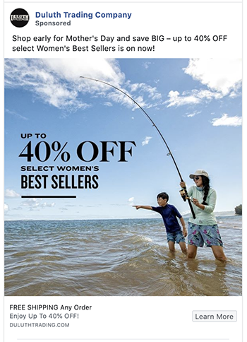
What to test: Directional composition against a centered product layout.
34. Gymshark: Show the Experience Your Audience Recognizes
Gymshark used vulnerability and insider humor familiar to people who train. The ad is not trying to persuade everyone that fitness matters; it is speaking to people who already know the experience.
Repurposing a post from another platform adds to that informal quality. Cross-platform reuse can work when the source format contributes authenticity, not when it appears as an accidental crop.
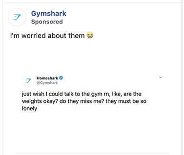
What to test: An honest training moment against aspirational fitness imagery.
35. RTIC Outdoors: Allow Proof to Dominate
RTIC’s minimalist ad gives the review visual priority. Stars signal the type of evidence before the viewer reads the full statement.
The restrained layout works because the testimonial contains the persuasive weight. If the review were vague, the minimalism would expose that weakness rather than solve it.
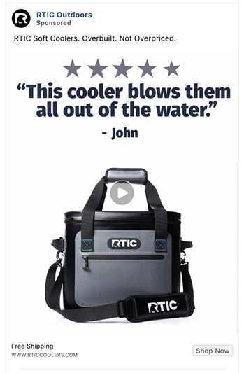
What to test: A specific customer review with rating context against a product-led ad.
Lead Generation and Local Facebook Ad Examples
36. Instacart: Recruit for Meaning, Not Only Income
Instacart was advertising to prospective delivery workers, not grocery customers. That audience distinction changes the entire message.
The ad frames delivery as useful work that helps other people while still providing income. It also acknowledges, indirectly, that the same worker may be considering rideshare or delivery alternatives.
The lesson is to identify the choice the audience is actually making. A recruitment ad competes with other work opportunities, not with grocery services.
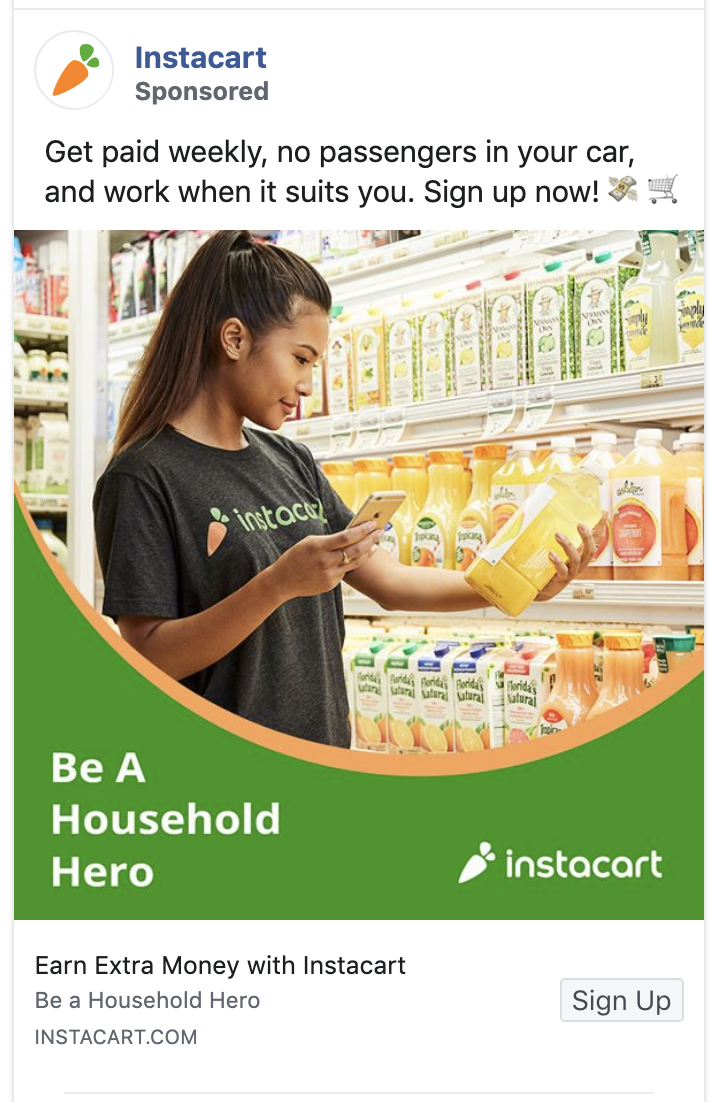
What to test: Purpose-led recruitment copy against earnings-led copy.
37. Drone Launch Academy: Reduce the Cost of Failure
The audience wants certification but may fear paying for a course and still failing the exam. The guarantee addresses that risk directly.
The copy formatting helps make a detailed offer easier to scan, but the guarantee is doing the strategic work. Risk reversal is persuasive when the condition is clear and the company can honor it.

What to test: A clearly explained money-back promise against the course benefit without a guarantee.
38. Denny’s: Give Customers Operational Clarity
Denny’s used advertising to explain how customers could interact with the business under changed conditions.
That is practical communication rather than a conventional promotion. The overlaid message makes the update hard to miss and connects it directly to the restaurant image.
The original ad reflected 2020 circumstances. The lasting lesson is to advertise operational changes when customers may otherwise assume the business is unavailable or difficult to use.
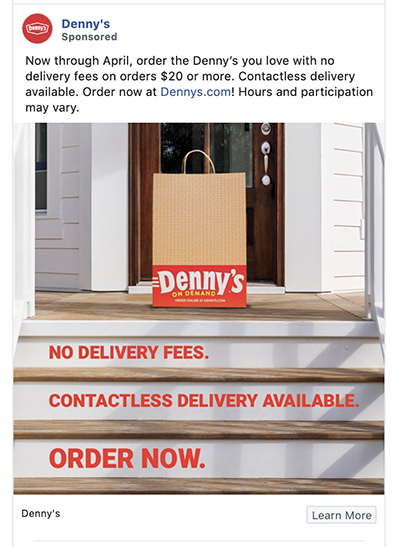
What to test: A direct service update against regular promotional creative during a change in operations.
Nonprofit, Community, and Awareness Examples
39. Panasonic: Use Scale to Recognize People
Panasonic did not need to explain what the company was. It used the ad to shape how people felt about the corporation by recognizing people doing valuable work.
For a large brand, appreciation can make communication feel less institutional. The challenge is sincerity. A thank-you message should connect to a real action or relationship rather than borrow goodwill from a moment.
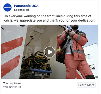
What to test: Recognition of a specific community contribution against a standard corporate message.
40. Yoga Anytime: Deliver the Value Inside the Ad
Yoga Anytime offered a short routine without forcing the viewer through a registration flow.
That makes sense when the immediate objective is attention, engagement, or a follow. The audience experiences the teaching style before being asked for anything. A recurring series can then create familiarity and provide natural groups for later remarketing.
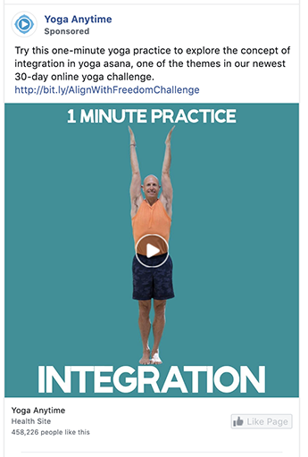
What to test: A complete one-minute lesson against a gated class preview.
41. Metal Lovers: Make Belonging the Product
Metal Lovers serves a community defined by a strong shared identity. The ad celebrates that identity instead of translating it for outsiders.
That makes the audience itself part of the value proposition: joining means finding people who already understand an important part of you. The creative can afford to repel people outside the segment because broad acceptance is not the objective.
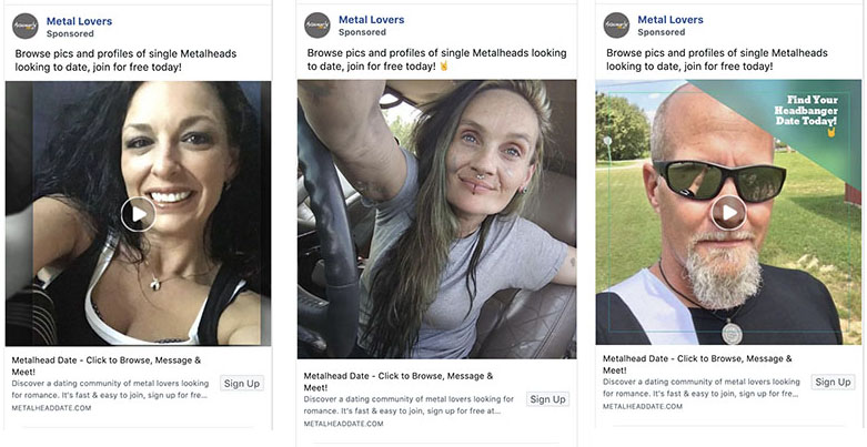
What to test: Community-first creative against a functional description of the dating service.
42. Wounded Warrior Project: Translate a Donation Into an Outcome
The Wounded Warrior Project example connects a donation amount with something tangible it can help provide.
That makes the request easier to evaluate. “Help” is abstract; a stated use for a specific contribution gives the donor a clearer picture of participation. The highlighted color directs attention toward the information needed to make that decision.
The organization should be able to substantiate any relationship between a dollar amount and the described impact.
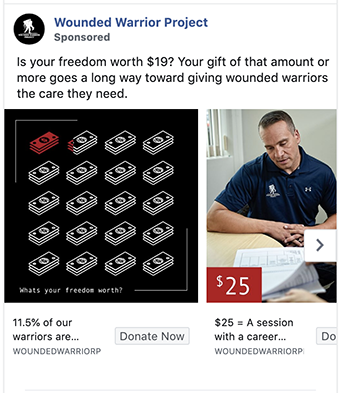
What to test: A specific, supportable impact statement against a general appeal.
What These Ads Still Teach in 2026
Some details in these examples belong unmistakably to 2020. Pandemic-era service updates, stay-at-home activities, old prices, old review counts, and former product claims should not be copied into current campaigns.
The creative principles are more durable:
- Correct the belief that stops someone from considering the product.
- Show the product doing the job instead of listing what it can do.
- Give each carousel card a clear role.
- Use proof that is specific, current, and supportable.
- Let the audience recognize itself in the language and setting.
- Remove an objection before asking for the click.
- Choose a format because it helps communicate the idea.
These are starting points, not laws. The only way to know whether one applies to your account is to test it against a credible alternative and evaluate the result that matters to the business.
A Better Way to Test Facebook Ad Creative
Begin with one question. For example: does this audience respond better to seeing the product in use or to seeing the outcome after using it?
Build two executions that differ mainly on that choice. Keep the offer, landing page, optimization event, and audience as stable as the account allows. Meta provides a native method for A/B testing ads, while Black Propeller’s Meta Ads Manager guide explains how campaign structure, tracking, and automation affect that testing environment. Give the test enough delivery to produce a useful read, then look beyond the cheapest click. The winning creative should improve the quality or cost of the intended result.
Creative is only one part of the path to conversion. If the ad earns the right click but the destination loses the visitor, Black Propeller’s guide to landing page form best practices offers a useful next layer of testing.
When a concept works, develop variations around the same idea:
- A different opening frame
- A shorter or longer explanation
- A customer voice instead of a brand voice
- Static, video, or carousel treatment
- Product demonstration versus outcome proof
This is how a swipe file becomes useful. You are not collecting designs to imitate. You are collecting questions worth testing.
Black Propeller combines paid social management with performance creative so media and creative decisions can inform one another. The team can review which concepts attract the intended audience, where people drop out, and which new variations deserve production.
Explore Black Propeller’s paid social services and performance creative capabilities to see how that work fits into a broader paid media program. You can also review the agency’s digital marketing case studies for examples of the work in context.
Frequently Asked Questions
Where can I find current Facebook ad examples?
Use the Meta Ad Library to search advertisers and view ads available in the library. Treat what you see as creative research. The library does not establish that an ordinary commercial ad is profitable.
Does a long-running Facebook ad mean it is working?
Not necessarily. It may be profitable, but it may also be part of an evergreen campaign, a low-spend test, an awareness program, or an account that is not actively maintained. Use longevity as a reason to investigate, not as proof.
What should I examine in a Facebook ad example?
Identify the intended audience, the belief or problem behind the message, the role of the visual, the reason for the chosen format, the offer, and the requested action. Then reduce the example to one testable principle.
Which Facebook ad format converts best?
There is no universally best format. Static images can communicate simple offers quickly. Video can demonstrate movement, process, or personality. Carousels can explain a sequence or comparison. The best format is the one that communicates the idea clearly and produces the desired business result at an acceptable cost.
How many creative variations should I test?
Enough to compare meaningfully different ideas without spreading the budget so thin that none receives useful delivery. Start with a small number of distinct concepts. Build more variations after the account identifies a direction worth developing.
Which Facebook ad metrics matter most?
Use delivery and engagement metrics to diagnose the creative, but evaluate success with the outcome the campaign was built to generate. That may be a qualified lead, purchase, booked appointment, subscription, or another valuable action. Cost and volume both matter, as does the quality of the result.
Can I copy an ad from the Meta Ad Library?
You can study its structure, but copying the creative, wording, or distinctive execution creates legal, ethical, and strategic problems. Extract the underlying principle and build an execution that belongs to your own audience, offer, and brand.