It’s not hard to find inspiration for Facebook ad examples. The Facebook Ad Library tool can show you every ad that’s running for your competitors or in other industries. You can search by keyword or advertiser to see which ads are running, how long they’ve run, and how much the advertiser is spending. It’s kinda like a candy store for Facebook ads inspiration.
It’s not enough to just have good Facebook ads anymore. If you want top-tier performance, you need great ads, ads that “stop the scroll.” You also need a lot of ads, ad fatigue is a real thing. And the more you spend, the harder you’ll have to work to stay ahead of it.
We use the Ad Library to spark ideas for new ads, and it’s helped us find dozens of great Facebook ad examples and ideas for what to test in ad creative. Here are some of our favorite finds.
1. Keap
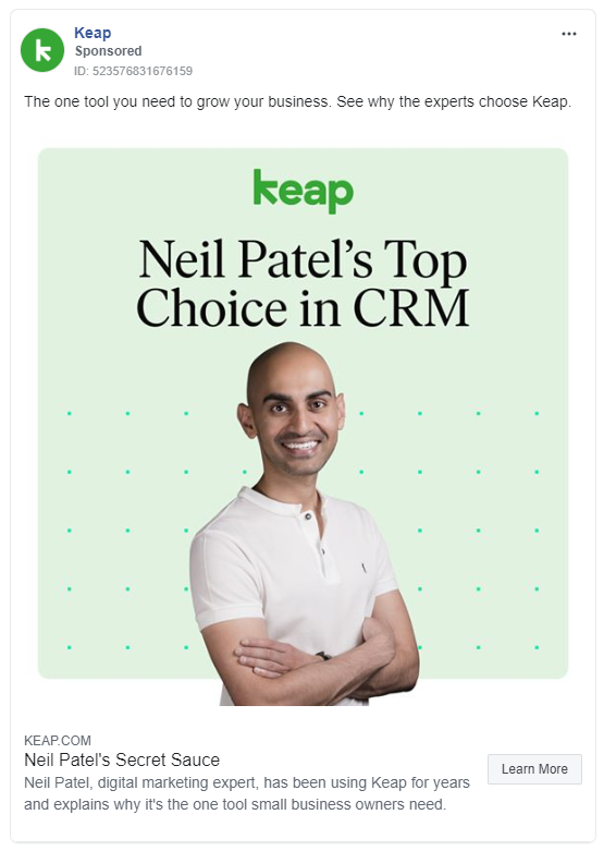
There are influencers, and then there are icons. Neil Patel is an icon. Or, as he might put it, he’s “a pretty big deal.” So when Keap can say they’re Neil’s top choice for a CRM, that’s a pretty big deal, too.
What Makes This a Great Facebook Ad Example:
- The influencer: Neil Patel has a massive following and undisputed authority in digital marketing and managing digital businesses. The second his fans see this ad, Keap will be on his fans’ shortlist if they need a CRM.
- The one tool you need: Digital marketers tend to use dozens of tools, often referred to as their “stack.” Managing all those tools and getting those tools to work together is no small task. The possibility of taking all that hassle away is a powerful motivator for this audience.
- The secret sauce: Everyone’s looking for their secret sauce, especially marketers. And if someone as successful as Neil Patel is calling Keap their secret sauce, that’s a pretty compelling endorsement.
2. DribbleUp
Most advertising messaging works off of a very simple formula:
- Identify a problem.
- Introduce the solution.
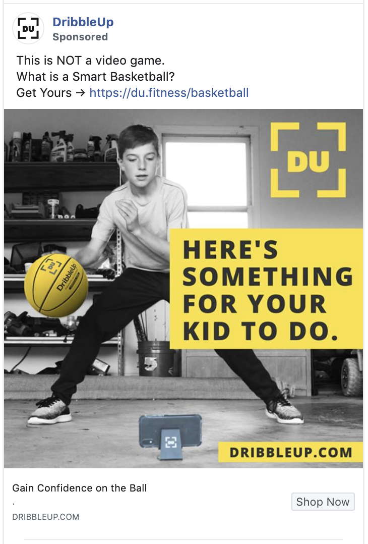
The art is in picking which problem to identify and how to describe that problem, and then offering the solution in a way that makes your audience want to leap into it. DribbleUp’s ad does all this, and in seven words (13 if you count the words in the text section above the photograph).
Why This is a Great Ad Example:
- Contrast: That black and yellow color contrast leaps off the page. DribbleUp uses this contrast to highlight the 3 most important elements in the ad: the call to action, the brand and the product.
- Explaining what it’s not: If people tend to dismiss or misunderstand your product, it’s critical that you develop concise, easy-to-understand messaging that breaks those preconceptions. “This is NOT a video game” immediately breaks a preconception, and it piques interest for parents. By positioning the product as a training device, and not a toy or game, parents are more apt to give it serious consideration.
3. Instacart
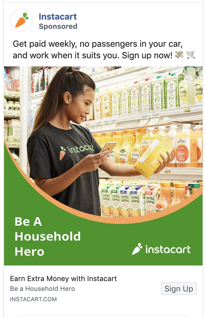
Instacart has two key audiences: The people it wants to deliver groceries to, and the people who will deliver those groceries. The purpose of this ad is to recruit the people who will be delivering the groceries.
What Makes This a Great Facebook Ad:
- It offers its audience the chance to be a hero: Most people are hard-wired to help others. So the opportunity to help people and get paid for it will appeal to many.
- Calling out the competition: Instacart knows that the people who are likely to work for them would also consider working for Uber or Lyft. And while it’s clear that’s who Instacart is calling out here, they were able to do it without any namedropping,. That makes the message even more powerful.
4. Noom
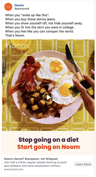
Noom is a diet app that wants to end dieting; they focus more on behavior change and the psychological side of eating. This gives them an edge in a ferociously competitive market, and they use their brand positioning well in their ads.
What Makes This a Great Facebook Ad Example:
- The copy: Love the ad copy here. Talk about “make ‘em feel” and tapping into inspiration. The “when you” repetition is almost like a mantra, and each variation is crafted specifically to echo the desires of Noom’s target audience. Noom helps the reader see themselves in each of the examples, then brings it all home with the “That’s Noom” close.
- The positioning: As mentioned earlier, Noom positions itself as an anti-diet. This is a smart way to reach the segment of the weight loss market they really want: people who are ready to make a permanent change in not just how they eat, but how they think about food.
5. Happy Socks
Want attention? Just be weird. Really weird. Especially if you’ve got the advantage of being a tiny startup or a small company that doesn’t have to go through rounds of creative approvals or legal reviews.
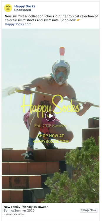
What Makes This a Great Ad Example:
- It “stops the scroll”: The eye immediately tries to figure out what it’s looking at. I spent a good 10 seconds just wondering about the steps and the rake, much less the headgear in this ad.
- It is unapologetically on brand: Even if that means it turns some other people off. If you’re the sort of person this ad appeals to, this brand’s off-the-wall approach will make you feel like you’ve found your tribe.
6. Green Bean Delivery
Anyone who sees a few of their favorite brands in the photo of this ad will immediately know Green Bean Delivery is a fit for them.
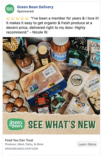
Why This is a Great Ad Example:
- The testimonial: People trust testimonials way more than marketing copy. (Please don’t tell our copywriter that.)
- The photo: It’s using a “real” photo, not a stock photo. Shiny, perfect-looking stock photos look, well…shiny and perfect. But they don’t look real. Often, a less-perfect looking but “realer” photo will out-perform the stock photo. Especially when it comes to people.
- The bottom section of ad copy: That logo and big type pull the eye down to the rest of the copy in the ad. Even more importantly, it pulls the eye down to the “Learn More” call to action button.
7. Muscle Milk
This is a product that appeals to a limited audience: people who strength train. But that limitation is actually an edge because it lets Muscle Milk not even pretend to be for everybody.
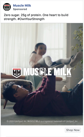
What Makes This a Great Facebook Ad Example:
- It’s true to its audience – Muscle Milk isn’t thinking twice about trying to be all things to all people. These ads are meant for their core audience – and nobody else.
- Great copy – As the end of the video says, “Muscle milk helps build muscle. But it takes heart to build strength.” That’s some tight copy. If that doesn’t make you want to go pound a bottle Muscle Milk and train like a madman, check your pulse.
8. Trolls
It’s smart to look beyond your industry if you want to find truly break-out advertising ideas. The movie industry is one of my favorite places for crossover ad inspiration.
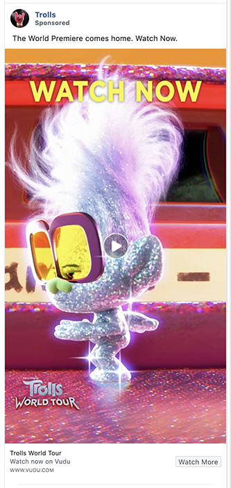
Why This is a Great Facebook Ad:
- Showstopping color: You want color? You’ve got color. And the sparkle just kicks it all up another notch. Even if you’re not a Trolls fan, you’re not likely to scroll past this ad without giving it a second look.
- Immediacy: Movie ads traditionally had to drive people to a theater. Not anymore. This ad gets to offer immediate access to the film. Instant gratification, instant conversion.
9. Drone Launch Academy
The drone business is booming and everyone wants in. I mean, who wouldn’t want to make a living flying a toy airplane around. But apparently, getting FAA certified isn’t all fun and games. That’s where Drone Launch Academy comes in.

What Makes This a Great Facebook Ad Example:
- The emojis in the ad copy: They break up the text so it’s not a wall of words.
- The guarantee: If you’re in their target market, being told you’ll either pass this test on the first try or get your money back makes this hard to say “no” to.
10. Mixtiles
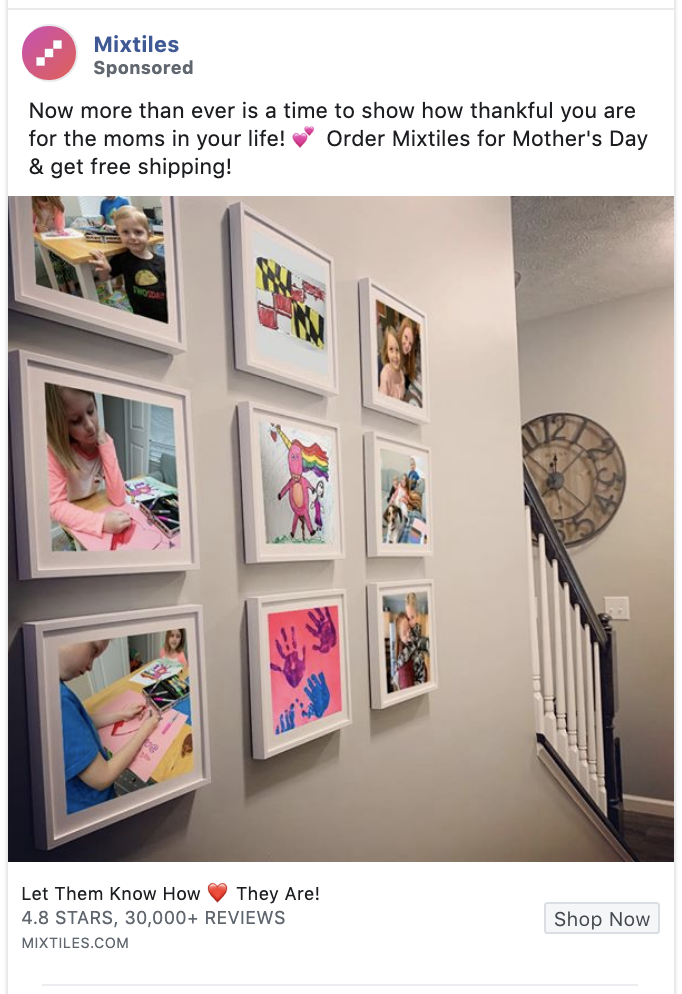
“Show, don’t tell.” What applied to your 4th-grade book report applies to advertising creative. Showing a product in action not only removes the need to explain what it does, but it also helps your audience to see themselves using it.
Why This is a Great Ad Example:
- Local appeal: That’s a Maryland flag in the top center frame of this photograph. As I’m in Maryland, this ad may be a clever example of a national campaign with local messaging.
- Social proof: Mixtiles is loved by its customers, and it has a lot of customers. So it’s smart to show the social proof of a 4.8-star rating from 30,000+ reviews. With that many people saying this is a great product, the company barely has to say anything else.
11. Panasonic
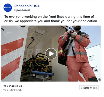
Panasonic doesn’t need to shout out its identity; we all know who they are. What it does need to do is to show its “human face” so that its audience thinks well of this multi-national brand.
What Makes This a Great Facebook Ad Example:
- Appreciation: There’s a well-earned hat tip to all the people doing good in the world. Not to diminish this messaging, but the formula of the “thank you ad” works well, especially for larger companies.
- It’s timely: It’s smart to make ads that are sensitive to what’s happening in the world. To “read the room,” as it were. This may be the biggest challenge to advertisers in 2020: How to understand how their audiences feel about what’s going on, and then how to speak to it.
12. Arizona Iced Tea
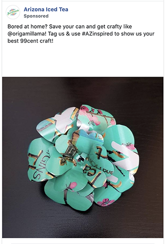
Any packaged goods product can play this game: Use your packaging as an arts and crafts project. Then invite your followers to contribute their own inspirations.
So if you sell physical products…what could they be made into? What could your shipping boxes be made into?
What Makes This a Great Ad Example:
- It’s unexpected. This is another example of a “visual surprise” in an ad. It’s a great way to make people stop and look twice.
- It meets people where they are. This is another ad that addresses what’s going on right now: Most people are stuck at home. Most of them are bored. So it offers them something to do.
13. Eggo
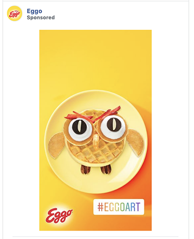
In honor of the character “11” from the TV show Stranger Things, here’s another example of an ad that makes its product into art. It looks so good…or maybe I just need to go get lunch.
What Makes This a Great Example:
- The hashtag: This is an especially visible, memorable, and attractive hashtag. It pops, whereas some of the other hashtag examples we’ve seen get buried in copy.
- It’s vertical: Reformatting your ad creative for different placements is one of the best ways to improve ad performance. It’s more work, sure…but it’s high-return work.
14. Headspace
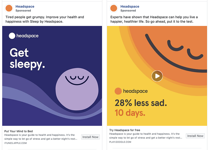
Headspace puts out consistently gorgeous ads. If you like flat design and bold, pure colors, take a look at all the ads they’re running.
Why This is a Great Example:
- The design. The simple, bold graphics of Headspace’s ads are unmistakable, even in the smaller-format ads that run on mobile devices.
- The promise. Who wouldn’t want to feel 28% less sad? And in just ten days? We don’t all get to say things that impressive and powerful about what we’re selling, but hey, when you can say stuff like that, run with it.
15. Chewy
Chewy is another advertiser worth tracking. They are a competitor brand (up against Amazon and Petco, among other places) and so they have to play the Hertz card and try harder.
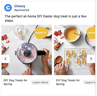
What Makes This a Great Example:
- The ad’s format: Facebook carousel ads don’t have to be only for ecommerce advertising. They’re also a great way to offer tutorials and other content in a series or catalog-esque format.
- It’s timely: This ad mentions both the Easter holiday and staying at home. And because it’s promoting tutorials, the ad also addresses another condition its audience may be struggling with: boredom.
16. Yoga Anytime
You probably already know how fragmented everyone’s attention is online. You’ve heard that stat about how even a goldfish can focus longer than a human does online.
So how might you apply that idea and make it work for you and your ads, instead of against them?
By offering bite-sized content. And bite-sized activities. Like a one-minute yoga routine.
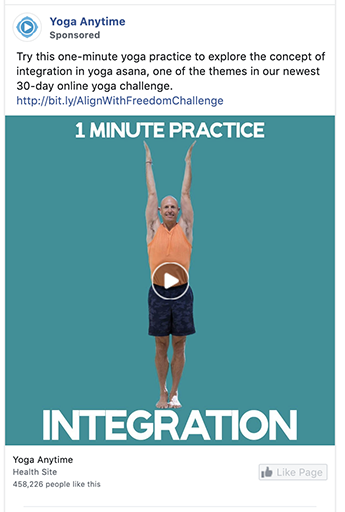
What Makes This a Great Facebook Ad Example:
- Instant gratification: There’s nothing to sign up for here. The tutorial is right there. The user doesn’t even have to click through and wait for a page to load. And single the goal with this ad is to generate new page like, there’s no need to make it more complicated. The formula here is simple. Give people something useful for free, and in return they may repay you with a page like.
- It’s part of a series: A series of ads on the same theme can build off of each individual ad’s performance. They also make a great opportunity for retargeting.
17. SEMRush
Personally, I prefer to wear a Google Analytics superhero costume under my work clothes, but hey – to each his own.
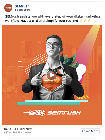
What Makes This a Great Facebook Ad:
- Emotional appeal: Ever heard that old saying, “I know great advertising when I feel it”? This is an ad that makes people feel. Especially the type of people who are likely to use SEMRush.
- FREE: It’s one of the most powerful words in advertising. It’s especially powerful when applied to something of value, like one month’s access to SEMRush. They usually charge $99.95.
18. Black Propeller
I know this ad works well. How well? Well enough for us to run it for a long, long time. But it also employs several best practices for Facebook ad creative.
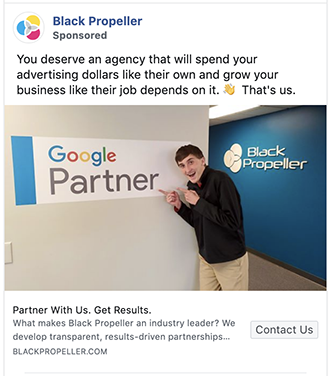
What Makes Our Ad a Great Ad Example:
- It was easy to create: All we needed was a wall in our office with the logo. And Nate. Any brand can do this. It’s just employee + brand sign + camera phone. 30 seconds to better ads.
- It’s in our office: Prospective clients want to know what it’s like to work with you. Showing your office is one way to do that.
- It shows a real person: As we mentioned in an earlier ad’s description, showing regular people usually works better than showing models in stock photos. Besides, we can’t have Nate thinking he’s a model or something.
19. Moz
Moz is a powerhouse when it comes to pretty much any kind of content. That applies to their advertising creative, too.
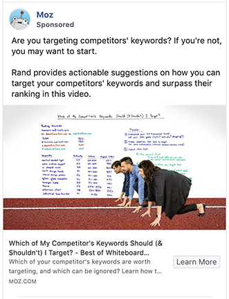
Why We Think This is a Great Facebook Ad Example:
- The background with the photograph overlay: This technique of showing an overlay with people and then a background with an interface, report, or other “flat” graphic is a theme we saw in a lot of ads. It works really well.
- The ad copy: Notice all the copy in the lower part of the ad. Some companies listed here go super minimalistic with copy in the bottom part of their ads. Not Moz. Maybe zigging while others zag is working for them.
20. Stitch Fix
It’s always interesting to see all the endless ways advertisers use the space they’re allotted. For example, in this Stitch Fix ad, the two squares in the image almost look like they are part of the interface, not a visual trick created by a savvy designer.
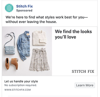
Why This is a Great Ad Example:
- The unique selling proposition: “We find the looks you’ll love.” It’s like an elevator pitch condensed into six words. And because the copy is surrounded by white space, it reads almost as easily as the logo.
- The surprise of “no subscription required.”: Stitch Fix is known as one of the first major subscription box companies. The subscription is their business model. Or at least it used to be. With just three words, they communicate that what you thought you knew about this company is wrong. Those three little words also remove most of the resistance someone might have about signing up with them.
21. Golfshot
There’s so much you can do with carousel ads. Especially if you have a multi-faceted product like Golfshot has.
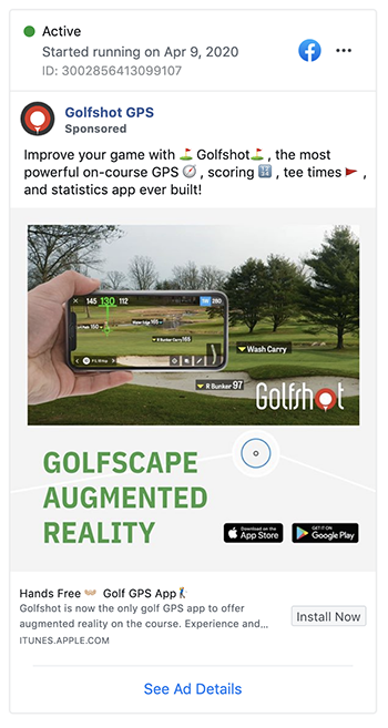
Why We Think This is a Great Facebook Ad:
- Each ad within the carousel shows a different feature of the app: If your product or service requires a set of steps to use it, creating a carousel panel for each element would work, too. It’s a clever way to pack a lot of information into an ad while still making it easy to understand.
- It shows the app’s interface: This is another spin on the old “show them what it’s like to use your product” strategy.
22. TailWind
TailWind is a social media tool for Pinterest and Instagram. All of its ads echo the lifestyle feel of both of those social platforms.
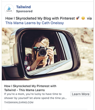
Why This is a Great Facebook Ad:
- The influencer: Influencer ads continue to work well in almost every industry. Anyone who follows This Mama Learns will immediately feel an affinity with TailWind.
- The how-to: I like that this isn’t just a product endorsement; the influencer is giving specific directions on exactly how she uses the tool to boost her blog.
23. Shopify
This ecommerce powerhouse is also a powerhouse of content creation, branding, and advertising in general. They are worth following on Facebook just so you can see what they’re doing with their ads.
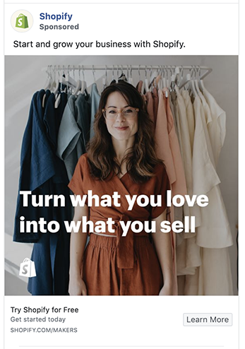
What Makes This Facebook Ad Example Great:
- The emotional appeal: Another example of the “great advertising makes you feel” principle. This ad evokes the pride small business owners feel as well as the inspirational idea of growing their business even more.
- The word “you.”: This isn’t the only ad here that uses the word, of course, but it’s worth calling out regardless. “You” is one of the most powerful words in copywriting. It’s right up there with “free.” Consider split-testing ad copy that uses “you” versus copy that doesn’t. It can make a big difference.
24. Metal Lovers
Embrace your tribe. Literally. Even if that means if you turn some people off. Metal Lovers is a dating site for metalheads, and while the idea of that might send some people running in the opposite direction, it’s a dream come true to metalheads.
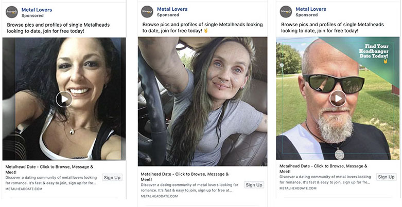
What Makes This Ad Example Great:
- Tribe identification: This is in the DNA of Metal Lovers given its business model, but the ads take the concept of celebrating one’s tribe even further.
- Celebrate your customers: Any time you can get people to identify with or see their reflection in the culture of your brand, it’s a win. That’s what these ads do over and over again.
25. Wounded Warrior
Wounded Warrior is one of the few non-profits included here, but whoever is creating their ads knows what they’re doing.
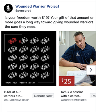
What Makes This Facebook Ad Example Great:
- Showing what even a small donation can do: Tying benefits to specific prices can be a good way to justify the sale (or the donation) at a time when people feel frugal. This ad demonstrates what $19 or $25 can buy, and it’s a pretty great deal.
- The use of color: Using red to accentuate information is a typography trick that’s been used for hundreds of years. Yet here it is, in a 2020 Facebook ad, accentuating the messages in this ad in a way that is easily understandable, even for people speed-scrolling through their newsfeed.
26. Asana
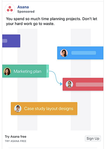
FOMO. It applies to fashion trends (like those fuchsia socks you thought were cool), BBQs, and selling stuff. Especially if you’re selling stuff with Facebook ads.
What Makes This a Great Facebook Ad Example:
- Emotional appeal: Asana’s ads always employ clean, simplified designs that evoke the feeling of simplicity and energy they want their users to enjoy. But this particular ad’s use of FOMO – losing your work and wasting your time – is exceptionally click-worthy.
- The graphic design: Showing people’s faces in what looks like an interface helps people see themselves using this software. It’s not just passing data back and forth between nodes – it’s allowing that lady with the marketing plan to share it with the guy in the red bar.
27. Monday.com
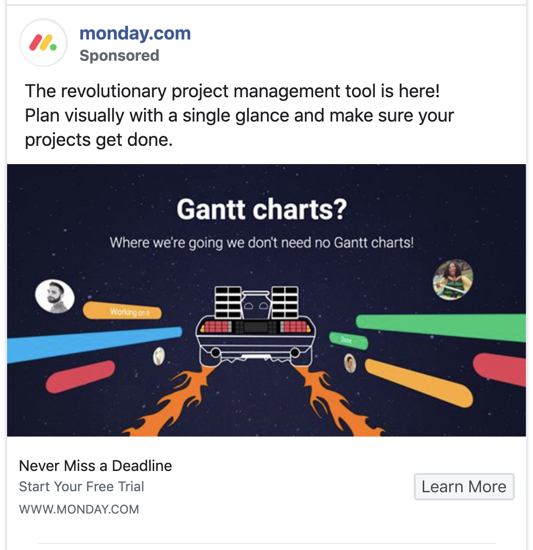
Monday.com is a project management tool with a lot of competition. It’s going up against some of the best marketing machines in the SaaS industry. So its advertising has to be good. Fortunately, it is.
What Makes This Facebook Ad Example Great:
- “Never miss a deadline.”: This is a benefit no project manager can ignore. It also speaks to how well Monday.com understands its audience. It knows what they fear the most.
- It disses Gantt charts: A lot of people dislike Gantt charts, but professional project managers often have to work with them anyway. So the promise of ditching Gantt charts is both audience-specific and another way for Monday.com to show it understands the people it’s targeting.
28. Gusto
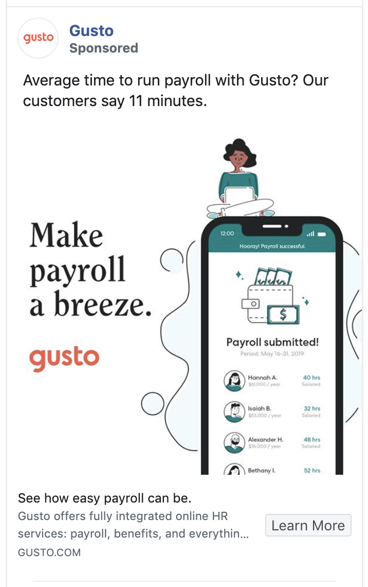
Gusto is an online payment and payroll service for small and micro-businesses. It’s built for companies that may not have an accounts payable department or even someone dedicated to managing finances full-time.
Why This Facebook Ad is Great:
- It’s specific: 11 minutes to run payroll? For the audience Gusto is targeting, the idea of that is so sweet that they probably don’t have to say anything else.
- It shows the success screen: Anyone who has had to work through managing payroll will get a little zing of energy when they see the confirmation page that payroll has been done. Showing Gusto’s version of that completion screen evokes that feeling of being finished with a dreaded task.
29. BigCommerce
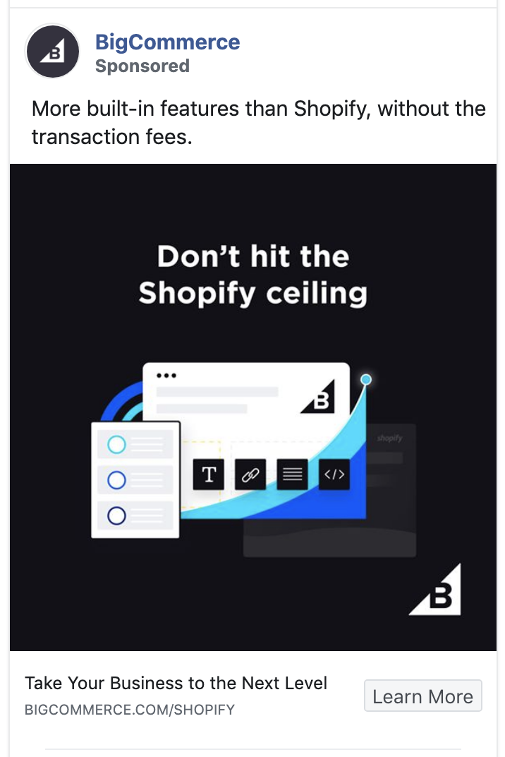
BigCommerce is like several other companies we’ve mentioned here: They are competing against some of the smartest marketing machines ever built. For BigCommerce, that competition is Shopify.
So how do they set themselves apart? By pointing out the key weakness of their competitor.
Why This Ad Example is Great:
- It doesn’t try to pretend the competition doesn’t exist: So many companies try to pretend they’re the only option available. They’re not, and their prospects know they’re not. BigCommerce has dropped that charade and is ready to go head to head with its primary competitor on a feature-by-feature basis.
- “Don’t hit the Shopify ceiling.”: Wait – what is the Shopify ceiling? I didn’t even know there was such a thing. As soon as I learned about it (from this ad) I had to go find out what it was.
30. Slack
Slack is up against a problem many complex, well-known products have: It’s got so many features that most people don’t know half of what it can do. Fortunately, if they keep running ads like this, they will educate at least some of their user base.
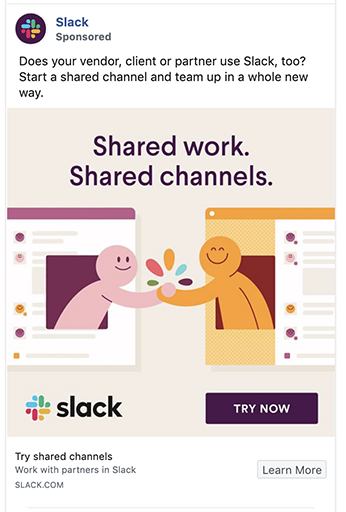
Why This Facebook Ad Example is Great:
- The button: Slack’s purple “TRY NOW” button looks like it’s the clickable element of the ad – kinda like a more visually appealing version of the bland-by-comparison “Learn More” button underneath it. These types of tricks can get clicks. Lots of clicks. Just wield your power wisely; some advertisers can weaponize this principle into sleazy advertising. But Slack is safely on the good side of that line in this case.
- The color scheme: Note how the colors in the ad mirror and complement the colors in Slack’s logo. Nice.
31. Treager Grills
Do people assume your products or services have certain limitations…but those assumptions are actually wrong? Ads like this can help.
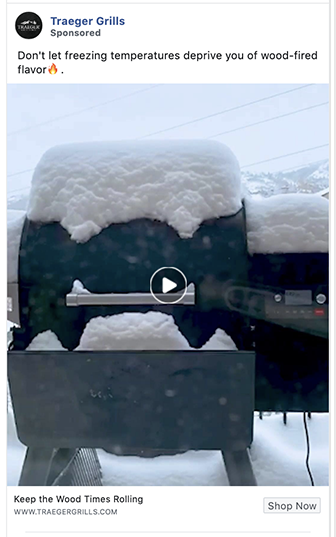
What Makes This a Great Ad Example:
- It shows the audience a way around a limitation (winter) they didn’t know was available: Wait – you can grill in the wintertime? This changes everything…
- It’s visually interesting: Putting a familiar thing in an unfamiliar context piques interest. It “stops the scroll.”
Add an element of surprise into your ads and you’ll immediately stand out from the sea of ho-hum stock photo ads.
32. Taboola
Taboola is a native advertising platform used by content marketers and public relations professionals. It’s well-known, but it has a competitor named Outbrain that is constantly threatening its market share.
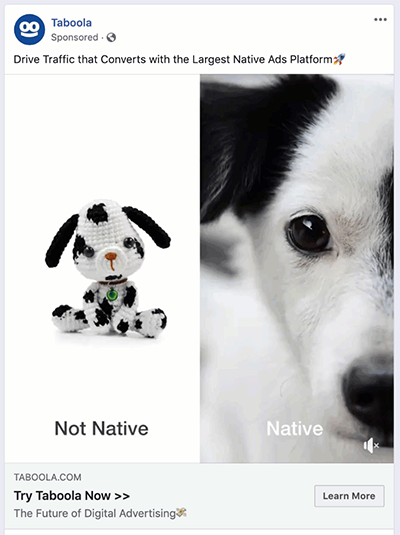
What Makes This a Great Facebook Ad:
- The comparison strategy: Here’s how it works: Take one core aspect of your value proposition, then illustrate its difference and advantage in a few different ways. This ad is an especially nice execution.
- The ad format: This is a perfect use of a carousel ad, which is tailor-made for the series structure of this presentation.
33. Harvard Business Review
In an era when so many print and digital publications struggle, Harvard Business Journal seems to thrive. Their subscription marketing and advertising is a must-follow if your business does anything related to subscriptions.
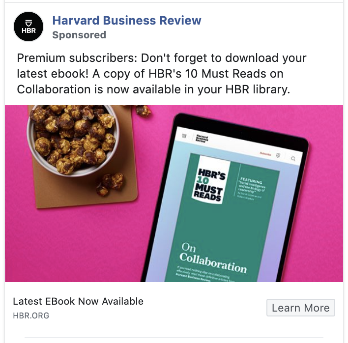
What Makes This a Great Ad:
- It’s retention marketing: Retention marketing is always a good idea, and advertising is an essential part of that strategy. The return on investment for retention ads tends to be especially good.
- It reminds existing customers of a feature they may have overlooked: Like the Slack ad earlier in this article, this ad is basically customer education. But that education is critical for HBR. The more features subscribers use, the more value they’ll get out of their subscription. The more value they get, the less likely they’ll be to cancel.
34. BarkBox
Like Stitch Fix above, BarkBox is a subscription model ecommerce business. They don’t have quite as much competition as some of the other advertisers we’ve included here, but they’re in a risky position in a tough economy: Dog toys and treats don’t generally qualify as essential purchases.
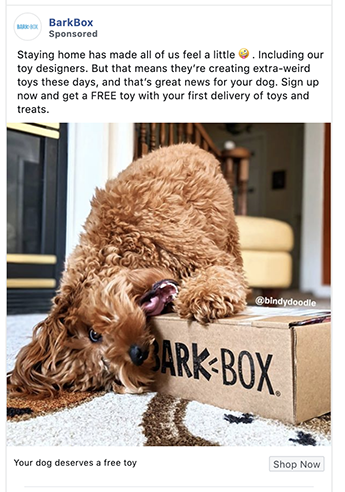
What Makes This a Great Facebook Ad Example:
- It’s fun: Even in a down economy, people just want to have fun. They need a break. Ads that entertain may do especially well this year.
- It uses misbehavior to capture attention: As some of us learned in childhood, misbehavior gets your attention every time.
If you want to kick this principle up a notch, get a photo of something about to go wrong. Preferably terribly wrong.
Photos of things that are about to go terribly wrong are irresistible. Everyone wants to know what happens next.
35. Oakley
There isn’t a lot of space in Facebook ads. You have to get to the heart of things fast. And Talking about love is definitely getting to the heart of things.
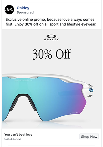
Why This Facebook Ad Example is Great:
- The photograph: Note the super-close view of the product here. If someone could hold your product in their hands and look at it up close, they’d be looking for details like this. So try a few super-close product shots in your ads.
- It invites people to give in to their emotions: One of the best ways to sell luxury goods is to give people permission to indulge their desires. To reward themselves. Oakley does this deftly in this ad without overdoing it.
36. Big Agnes
As Seth Godin says, “be remarkable.” Especially if you’ve got a brand based on fun.
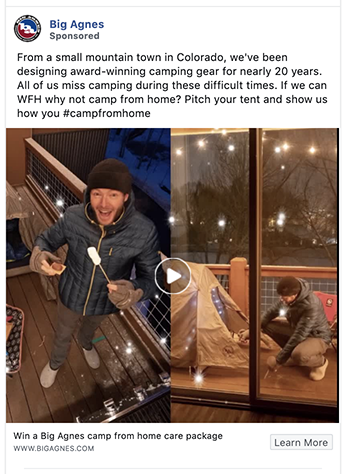
Why We Like This Ad Example:
- It asks for audience participation in an unusually fun way: Big Agnes is an outdoor gear retailer that uses a considerable amount of personality in its marketing. It’s embracing that quirkiness in this as by inviting people to camp out on their porches as a way to compensate for being in lockdown.
- It employs four classic best practices for Facebook ads: In one ad, Big Agnes is”
- evoking user-generated content.
- leveraging a larger cultural theme.
- showing your products in use.
- being weird and relatable in a way their audience will appreciate.
37. Rit Dye
Even if you aren’t into crafts, Rit Dye is a brand worth following on Facebook. They are exceptionally creative in their ads and throughout all of their content.
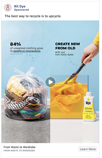
Why We Like This Facebook Ad:
- The before and after presentation: This is a great example of the “from bland to grand” ad creative formula, also known as the “before and after” ad.
- The epiphany: Rit’s audience probably knows how much waste the fashion industry produces. The idea of being able to turn that waste into something fun is a new idea, and a great prompt to use their product.
38. Duluth Trading Post
Sales are a great way to bring in new customers or to bring back existing customers. And Mother’s Day is a great excuse to splurge a little.
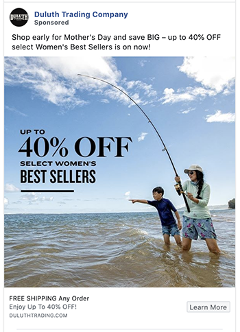
What Makes This Facebook Ad Example Great:
- The pointing: See how the kid and the rod are pointing towards the copy? This is known as a “visual cue,” and it’s a trick that’s been increasing conversion rates for decades.
- Free shipping: This isn’t the only ad listed here that mentions free shipping, but we’d be remiss to not highlight this best practice. Free shipping is one of the most powerful offers going. If you haven’t tested it in your ads yet, get on that.
39. Denny’s
Instead of going silent like so many of its competitors, Denny’s is advertising. Being visible has always been the best way to stay top of mind, but right now it just might keep them in business.
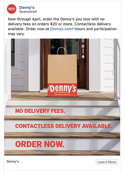
Why We Like This Facebook Ad Example:
- It shows that Denny’s has pivoted to meet current conditions: These “service update” type of ads are really popular right now. Customers want to know how to do business with brands under these new conditions.
- The way the messaging is overlaid on the photograph: Not only is this a cool way to weave messaging into an ad’s photograph, but this particular example also anchors and amplifies the message.
40. WebinarJam
WebinarJam is mostly known as a sales tool for digital marketers, but it can also be used as a training platform.
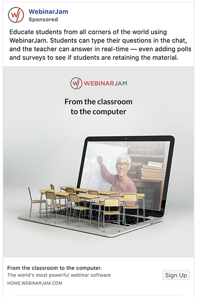
Why This Facebook Ad Example is Great:
- The tagline: It’s interesting that it’s six words. There’s a whole movement around telling six-word stories. The six-word story also happens to be a highly effective construct for social media advertising.
- The image: Images often influence ad performance more than copy does, so picking the right image is critical. This image nails its messaging so perfectly that WebinarJam’s competitors must be kicking themselves for not thinking of this sooner.
41. Gymshark
There’s one proven way to stand out and be true to your brand on social media: Be vulnerable and weird and honest. In a way your true peeps will understand. This ad nails that principle.
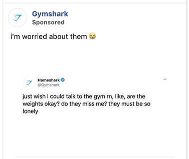
What Makes This Ad Example Great:
- It is true to its tribe: Like MuscleMilk and Metal Lovers, Gymshark is dialed into its audience. This ad is only for them.
- Every time you make your audience smile, you have cemented your connection to them.
- The crossover post: Using a post from another platform as an ad is an unusual move, but it works here. Might be worth a test for you, too.
42. RTIC Outdoors
Minimalistic ads work. Especially if every one of their essential elements is strong. And especially if the ad is running in a “noisy” space like Facebook’s news feed.
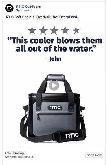
What Makes This Facebook Ad Example Great:
- The stars: Those stars telegraph “review” right to the reptilian brain. Use them with testimonials wherever possible.
- The testimonial: We opened this list of Facebook ad examples with a testimonial, so let’s close with a testimonial. Especially a testimonial so strong and so clear that there’s really not much else to say.
Final Thoughts
Think Beyond the Stock Photo & Canned Copy
Any one of these 42 Facebook ad examples could lead to a huge boost in ROAS for your Facebook ad campaigns. But only if you test them. And probably only if you test them multiple times.
That’s what’s so interesting (and humbling) about Facebook advertising. Often what we think will do well flops. Then the crazy idea we were sure would fail takes off.
So yes, play it safe with your Facebook ads enough of the time to maintain the results you need. But don’t play it too safe. The big leaps in advertising performance often come from risky, unusual ads. Boring ads make for boring results.


